Type & Layout
In terms of layout and type it's important to analyse
characteristics of both European and Japanese style
modernism of the 50's to 70's.
_________________________________________________
Neue Grafik
Magazine
-
Europe
Published quarterly in Zürich, Switzerland from 1958-1965
(17 issues, 18 numbers – the last issue 17/18 was a double issue),
Neue Grafik was arguably the most important journal responsible
for disseminating contemporary and historical Swiss functional
design ideas and philosophies referred to as the “International
Typographic Style”, “Swiss New Typography” or
“Objective-Functional Typography”.
Early issues sent to subscribers included colored identifying
bands with a cover designed by Vivarelli (although after issue
No. 1, Neuburg is listed as designer) entirely of text to inform
(rather than illustrate) the magazine’s content.

4 column grid
Akzidenz Grotesk Bold
2 variations of pt size For title and bodycopy.
Massimo Vignelli
-
Europe

Use of odd & even numbers _
If grid is even number wide, it's even number down x 2
For example 3 x 6, 5 x 10

2 different pt size
Use of weight for type hierarchy
Herbert Bayer
-
Europe
.jpg)

Often uses 2 colours + stock
Pt size variations slightly more than Swiss style, sometimes 3-4.
Use of Bold and Light, Uppercase
Akzidenz Grotesk
Tokyo World Design Conference
1960
-
Japan
.jpg)


Early dawn of Japanese modernist design.
Noticeably European influenced
Use of 4 column grids
No more than 2 pt size
Body copy bold or regular for hierarchy
Yusaku Kamekura
-
Japan

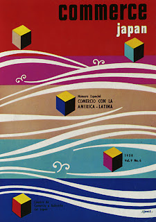
More decorative form of modernism
Strict policy on pt sizes remains. No more than 2-3
More decorative typefaces &
Use of imagery, less prominence and space given to type
No comments:
Post a Comment