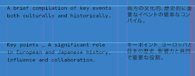
Currently working on the timeline sheet which will be binded as a bridgegap between the book and poster elements.
Again I've tried to be subtle here and instead of using a classically European grid incorporating even numbers, I've gone with a 5x11 grid for this, to give the more more of a loose and flexible feel, although not really noticeable on the surface and I'm hoping to add more decorative elements to reference Japanese design but without being too obtrusive to the overall effect.
All white heading text is going to be white vinyl to give added tactile feel and to also act as a sort of spot colour. The timeline is a one colour 100%K print on blue stock.
I hope to be at this stage, printed and bound by tomorrow afternoon
Development snapshots_
5 column grid in use. The T
Selected information is also available nearby in Japanese symbols too to create the feel of a collaboration and partnership between the two, a message I want to convey throughout.
I also use half of columns widely too, I usually don't mark them out as the grid can look a bit too mental, but I've been working within columns too but making sure things still line up and it gives more options when working with individual elements in terms of placement and picking out certain elements across the page you can line them up with to create a visual balance to it.
Really enjoying this and I'm very pleased with how it's turning out. By tomorrow the timeline and book will be bound together and complete, the only section remaining is the posters which I've alloted myself 2-3 days / the coming weekend for.


No comments:
Post a Comment