P
O
S
T
-
M
O
D
E
r
N
i
S
M
Postmodernism is a reaction and the aftermath of modernism. Modernism was in relation to modernity, constructing society, form following function, experimentation with legibility, grids, communication, efficiency within everything was key. Whether it was painting, architecture or graphic design. A criticism of modernism, that I think I agree with is the lack of individuality and the idea of designers conforming to certain design principles and rarely going through intense experimentation personally. The lack of individuality is a possible crticism aswell. Peoples needs were regarded as less important compared to design principles.
Post-modernism was a reaction to modernism, It had a hint of satire, pessimism, and a disillusionment with the idea of absolute knowledge and rigidity of the modernism style before them. It's characterised by more expression and individuality, more use of various media and experimentation with content, with the use of collages, cut and paste etc. Less of a rigid grid system, some would say legibility is sacrificed but other post modernism designers argue against this. The following are artists I associate with this movement for reasons I'll try and explain.
David Carson
I think one look at David Carson's work, illustrates how different his work is to a modernist graphic designer such as Herbert Bayer. I enjoy Carson's work as, in a similar sense to Brody which I'll discuss later in the post, it's pretty adventurous in the layout but a lot of thought obviously goes into place for it to still be as optimally legible as it can be. A lot of thought must go into play, when thinking about the hierarchy of information and how the eye follows the page. He's possibly most famous for his innovative graphic design and experimentation and his 'grunge' typography. I watched the 'Helvetica' movie once and it's clear he's quite opinionated on the rigidity and 'boring' nature of some modernism and lack of expression.
"Don't confuse legibility with communication. Just because something is
legible doesn't mean it communicates and, more importantly, doesn't mean
it communicates the right thing" - David Carson
"I have no formal training in my field. In my case I've never learned all
the things I'm not supposed to do. I just did what made sense to me. I
was just... experimenting, really. So when people started getting upset,
I didn't really understand why, I said, "What's the big deal? What are
you talking about?" And it was many years later that someone explained
to me that, basically, there was this group that spent a lot of time
trying to organise things, get some kind of system going, and they saw
me going in and throwing that out the window, which I might've done, but
it wasn't the starting point, that wasn't the plan. Only much later I
learned what determines modernism, and this and that..." - David Carson


Neville Brody
I think Brody has some quite modernist pieces, such as some of the typefaces he has designed which are pretty legible and sans-serif, but I find his graphic design to generally be quite experimentative. Brody himself got in trouble at college, because of his experimentation and 'rebellious' approach to art and the punk movement, in contrast with a sensible approach to design in the economic climate.
"An electrician isn’t an opinion former, but a graphic designer is. My
argument is that all graphic designers hold high levels of
responsibility in society. We take invisible ideas and make them
tangible. That’s our job." - Neville Brody
"We are so obsessed with
the Net and technology that we forget the message... We imagine to be able
to do anything, and our software helps us believe we can... But we must
move beyond the 'how' to reconsider the 'what' and the 'why'..." - Neville Brody

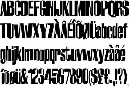
FF Harlem by Brody. Quite a psycahdelic 60's aesthetic, even though it was designed in 1993.

Really like this example. It's inventive but at the same time pretty legible. A lot of thought must have been put into where the eye naturally leads when reading this, for optimum communication while still being quite experimentative in terms of layout.

Roy Lichtenstein
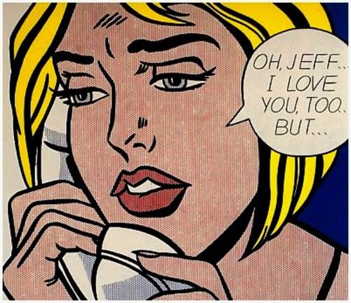
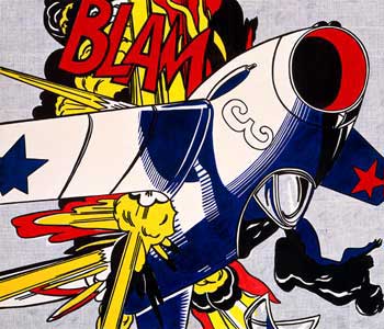
Lichtenstein is an iconic graphic designer and illlustrator who is synonymous with the pop art movement. The pop art movement itself was an examincation of post-modern society, pulp, industrialisation and mass art. Lichtenstein often provided social commentary through his work and often took something 'unimportant' and got it into galleries. Satire of society and the high/art low art culture related in art. Slightly tongue in cheek in content.
"I think we're much smarter than we were. Everybody
knows that abstract art can be art, and most people know that they may
not like it, even if they understand there's another purpose to it." - Lichtenstein
"I'm interested in what would normally be considered
the worst aspects of commercial art. I think it's the tension between
what seems to be so rigid and cliched and the fact that art really can't
be this way." - Lichtenstein


Andy Warhol
An example of Andy Warhol's post-modernism is his Marilyn Monroe piece. Not an attempt at painting Marilyn. Found publicity images used to make Marilyn to print it. Didn't even print it in "The factory". If things go wrong, fine, leave it like that. He didn't treat artwork as precious or serious in that
respect, which is different to modernism. Society creates the image, creates the stars.
Technology isn't perfect, it's flawed in different ways.
“Art is what you can get away with.”
― Andy Warhol
“An artist is somebody who produces things that people don't need to have.” - Andy Warhol


Jamie Reid
Jamie Reid is a graphic designer and anarchist who came to prominence in the 60s and 70s with the punk movmement. He had close ties to the punk movement and in turn the Sex Pistols and the radical magazine and publication Suburban Press. Punk rock as a musical movement is itself a post-modernist movement. His cut and paste collage pieces he made famous with the Sex Pistols is in my view an example of post-modernism graphic design. As there's no 'skill' needed in a technical sense, more idea driven, anyone can do it. A sort of criticism of technology and society. Cut, pasted and photocopied. Mass copies of same art work. Jamie Reid's work went on to define the Punk rock aesthetic.
BOB: So design "ideas" were coming from
deadlines, whatever ink's available, deadlines, accepting fuck-ups
simply because you couldn't go back and do it again.
JAMIE: Yeah. In very many ways that was the look that later became associated with the Pistols and punk. Its whole base was anarchist community situations and the printing press. And then just moving it into popular culture, which was quite a conscious thing on mine and Malcolm's parts. That's what we did.
JAMIE: Yeah. In very many ways that was the look that later became associated with the Pistols and punk. Its whole base was anarchist community situations and the printing press. And then just moving it into popular culture, which was quite a conscious thing on mine and Malcolm's parts. That's what we did.


No comments:
Post a Comment