Saturday 8 March 2014

Graphic Design is Good For Your Health

Following on from my dissertation and some of the conclusions and aims I applied towards my physical resolution - this article has been really interesting in reaffirming some of my ethics and design approach moving forward.


Katie Treggiden, looked into how considered design is being used to aid, and improve the lives of patients and staff in a hospital. It's this exact notion which I strongly believe in. Anxiety and depression in todays world is probably higher than it has ever been, and the role design plays in our everyday interactions is underestimated.


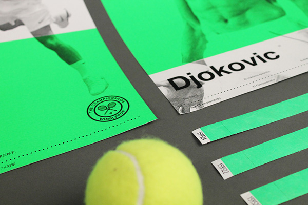
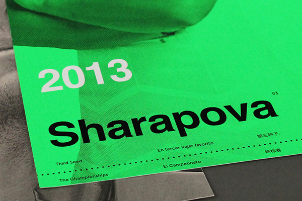
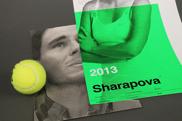
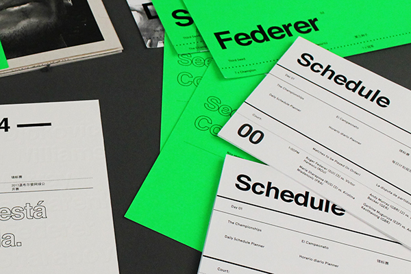
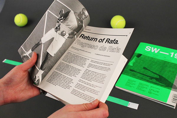
Designing something to be considered, and almost meditative, does not at the same time mean everything should be set in helvetica bold and lack character. I don't believe in this, I believe good design should simply say what it needs to say and be efficient in doing so. Whether it's a minimal and information brochure, or a loud, colourful gig poster. It should encapsulate the vibe it wants to put across, communicating different messages to different people - but everyone coming away better off.


Graphic Design is 
Good For Your Health
                                                                                                        
24/01/14


Ask someone how graphic design could reduce aggression in A&E or anxiety in cancer patients and you might get some blank looks. Yet graphic design is exactly the solution that’s being used in two such projects.
Katie Tregidden, founder of Confessions of a Design Geek, took a look at how design is being used to improve the lives of patients and staff.
Graphic Design is Good for Your Health
A Better A&E is PearsonLloyd’s response to a Design Council brief to reduce violence and aggression in hospitals’ emergency departments. “The brief was as open as that,” says Tom Lloyd. “One of the first decisions we made was that we’d tackle low level aggression. If you hear a respectable person shouting, it gives permission to the people around them to behave in a certain way. We had a hunch that if we could address this, we’d reduce the violence that escalates from it.”
To aid their own understanding, the team put their findings on post-it notes around the studio, creating a flow diagram of the A&E journey. “We looked at it and suddenly realised that if everyone understood the process, most of the frustration would be eased. So the heart of the project was about providing information and context,” says Tom.
Graphic Design is Good for Your Health
“Some of it was simple – communicating the fact that people are seen in order of severity rather than attendance, letting them know how long they might have to wait, explaining that they might have to wait more than once.
And then it was about clarity. The colours were chosen not to be in conflict with existing signage. We used contrasts to maximise legibility. Some people will be admitted while they’re unconscious, so we had to make sure that all the information was in every space. And every graphic is floor to ceiling - we needed to create impact.”
Graphic Design is Good for Your Health
The results of the pilot were phenomenal: 88% of patients said that the new signage clarified the A&E process, 75% said it made the wait less frustrating, offensive language has reduced by 23%, and threatening body language and aggressive behaviour was halved.
Meanwhile at Design Academy EindhovenRenee Scheepersdeveloped Revealing Maps of Cancer Care as her graduate project. “Research shows that a lot of cancer patients don’t understand the treatment plan they are going through. Only 20% of the information they are given is taken in.”
Graphic Design is Good for Your Health
Much like PearsonLloyd, Renee realised that providing information in a way that patients could digest would help them to understand what was happening to them and reduce anxiety. “I tried to divide the process into little steps, so patients can follow step by step along their journey. They have an overview of the whole process, but they can also go a step back, go a step forward – and see visually what is going to happen instead of through written or spoken words.”
“It's important to use visuals, because they are much more effective than text,” says Renee. “Images are easier to understand and remember. By showing people rather than telling them what is going to happen, you remove some of the initial fear.”
 “I'm working for Institute Verbeeten now, where I did my research. We're finalising the design and working on a plan for implementation in three hospitals this year."


Source <


Friday 17 January 2014

OUGD601: End of Module Evaluation

OUGD601 End of Module Evaluation

- - - - - - - - - - - - - -- - - - - - - - - - - - -


Positives and learning curves throughout module

I feel throughout the module, my research skills in terms of reading, writing, sourcing has improved. The dissertation was a huge body of work to take on, at first it was pretty daunting and overwhelming, but as the process of research developed I also feel my own skills and competence developed too – particularly in terms of primary research and reaching out to contemporary practitioners. I have been selective with primary research carried out, and feel it has been hugely influential in my own growing awareness of global design practice and influence, it definitely helped inform the conclusion of the written piece as we could debate and compare opinions.

I managed to engage in dialogue with studios such as Experimental Jetset, and 2xElliot which are hugely inspiration personally and relevant towards research into contemporary design studios adhering to clinical concepts and execution. Their answers were directly influenced in my dissertation, and moving forward I am much more confident in carrying out primary research in the form of e-mails/phone/face to face interviews, I’ve learnt even though a designer is famous, or well known in design circles, doesn’t mean he will not have time for you.


Collaborating across the world has been successful, although limitations of collaborating and globalisation in terms of dialogue with designers have come to the surface. It has been really interesting to engage with designers from different cultures, backgrounds and discuss a common subject – the Wimbledon project. Not all collaborators had a chance to influence the design individually, as waiting for replies and messages in your inbox is a definite issue, and still does not beat a face to face conversation and instant replies. However all of us discussed concepts, ideas and visual objectives and I feel although not all of us had a go on the design piece, the finished result reflects all of our opinions and collaborative influences.

-


Difficulties faced throughout the module

A definite negative throughout the early segment of the module, and especially so pre-level 6 during summer, indecisiveness was an issue. I found it difficult to narrow down my own position within the design scene and an issue I was passionate about and interested in. I changed from advertising within sci-fi movies, to analogue design vs. digital design, to the current topic. In the end, the subject I’ve chosen, I feel represents my own growing approach to design and definitely my own opinion, and an opinion I’ve discovered a growing number of people share – considered, almost meditative design in an increasingly irregular environment.

The concept for my primarily practical was informed by the closing chapters and conclusion of my critical writing piece, so when a concept came about in synchronization with the final chapters, timeframe was an issue. Designing individually in a two-week timeframe would be perfectly achievable, but we had to take into account the schedules of our collaborators and the logistics of sending and receiving work. This made the closing period of the module stressful, and as I was designing towards the opinion of 3 other designers, made me hesitant to design as freely as normal.

Not all collaborators had a chance to influence the design individually, as waiting for replies and messages in your inbox is a definite issue, and still does not beat a face to face conversation and instant replies. However all of us discussed concepts, ideas and visual objectives and I feel although not all of us had a go on the design piece, the finished result reflects all of our opinions and collaborative influences.

We feel it illustrates an alternate and effective reconsideration of a global sporting context, showing the effectiveness of communication and user experience when reducing type and image down to the necessary information, the beauty is in the simplicity.


What I would do differently next time

Next time around, I would send out primary research and e-mails to individuals and studios much sooner, sending emails out and comparing and contrasting opinions was pivotal in finding a focused research theme. Doing this sooner would have allowed me to drop into a research theme much sooner, and make the work schedule less heavy and intense.

I would allow more time for collaborating digitally around the world, I didn’t expect logistics of sending and receiving files, and waiting for e-mail replies in order to send or receive work to be such an issue, you must take into account different peoples schedules and availability, everyone has different working lives. It has been an eye opening experience to collaborate with designers outside of college, and completely digitally without a face-to-face conversation.


Ratings (Very Bad) 1 - (Very Good) 5
Quality of work _______ 4
Quantity of work ________ 4
Attendance ________4
Punctuality _________3

Motivation _________4

OUGD601 Cop3 Submission:: Rationales / Presentation Boards / Statement of Intent

Primary Practical (Wimbledon) Rationale _


Primary Practical (Wimbledon) Presentation Boards _


Pre-Practical body of work Rationale _


Pre-Practical Presentation boards _
---

Statement of Intent Level 06 / Cop3


List of Illustrations - Practical (Wimbledon) & Pre-Practical Body of Work

List of Illustrations – Primary Practical (Wimbledon )


Emirates247 {2012) ‘Novak Djokovic Australian Open 2012’ [Image Online] Available at: http://cdn-wac.emirates247.com/polopoly_fs/1.440093.1327848674!/image/3674428041.gif [Accessed 13/1/14]

Sport24 (2012) ‘Roger Federer Wimbledon 2012 Forehand Shot (AFP PHOTO / PAUL GILHAM / POOL)’ [Image Online] Available at:  http://cdn.24.co.za/files/Cms/General/d/1988/ad6e9b3e9ab74849a6d3985dbc9cfa1a.jpg [Accessed 14/1/14]

Juniortennis (2012) ‘Rafael Nadal French Open Final 2012’ [Image Online] Available at: http://www.juniortennis.ru.images.1c-bitrix-cdn.ru/upload/iblock/a52/f_06-07-GalerieNB-Nadal02-650.jpg?133919126049606 [Accessed 13/1/14]

Iceaxeandheels (2013) ‘Maria Sharapova Wimbledon 2013 Collection’ [Image Online] Available at: http://1.bp.blogspot.com/--4SaA9Fltio/UcgyjwZPxGI/AAAAAAAADcg/O-2gjqlM4-A/s320/NIKE_TENNIS_MS_S2_0073_20489.jpeg.jpg [Accessed 14/1/14]

Nikeblog (2013) ‘Roger Federer Wimbledon 2013 Collection’ [Image Online] Available at: http://cdn.nikeblog.com/wp-content/uploads/2013/06/Roger-Federer-Wimbledon-2013-2-150x150.jpeg [Accessed 14/1/14]

Nikeblog (2013) ‘Maria Sharapova Wimbledon 2013 Collection_2’ [Image Online] Available at: http://cdn.nikeblog.com/wp-content/uploads/2013/06/Maria-Sharapova-Wimbledon-2013-2-150x150.jpeg [Accessed 14/1/14]

Tennisandco (2013) ‘Roger Federer Wimbledon 2013’ [Image Online] Available at: http://tennisandco.files.wordpress.com/2013/06/xvxvxb.png [Accessed 14/1/14]

Timesunion (2013) ‘The last time a Brit won Wimbledon’ [Image Online] Available at: http://ww2.hdnux.com/photos/22/51/10/4887089/3/628x471.jpg [Accessed 14/1/14]


Thestar (2014) ‘Serena Williams close-up Wimbledon 2013’ [Image Online] Available at: http://www.thestar.com/sports/tennis/2013/06/27/wimbledon_serena_williams_refuses_to_be_upset.html [Accessed 14/1/14]


///////////////////////


List of Illustrations – Pre-Practical Body of Work


Wikiartis n.d. ‘Otl Aicher’ [Image Online] Available at: http://www.wikiartis.com/media/images/profilbild/otl-aicher.jpg [Accessed 29/12/13]

Archdaily (2012) ‘Dieter Rams Braun Coffee Machine KF20 1972’ [Image Online] Available at: http://ad009cdnb.archdaily.net/wp-content/uploads/2012/01/1326137811-12-sfmoma-rams.jpg [Accessed 29/12/13]

Chairman Of The Board (2011) ‘Dieter Rams’ [Image Online] Available at: http://chairmanoftheboard.files.wordpress.com/2011/10/young_dieter.jpg?w=529 [Accessed 29/12/13]

Webexpedition18 (2011) ‘Braun RT Table Radio’  [Image Online] Available at: http://webexpedition18.com/wp-content/uploads/2011/11/braun04.jpg [Accessed 29/12/13]

Iainclaridge.net (2011) ‘Braun Lectron’ [Image Online] Available at: http://www.iainclaridge.co.uk/blog/wp-content/uploads/0511/braun_lectron1.jpg [Accessed 29/12/13]

Matdolphin (2012) ‘Müller-Brockmann portrait’ [Image Online] Available at: http://www.matdolphin.com/wp-content/uploads/2012/02/JosefMullerBrockmann.jpg [Accessed 29/12/13]

Designersgotoheaven.com (2010) ‘Müller-Brockmann and Paul Rand IBM Design Seminar’ [Image Online] Available at: http://31.media.tumblr.com/tumblr_l14v5yWtfc1qz6flco1_500.jpg [Accessed 29/12/13]

Noupe (2011) ‘Josef Müller-Brockmann: Principal of the Swiss School’ [Image Online] Available at: http://www.noupe.com/wp-content/uploads/2011/08/josef-mueller-brockmann.gif [Accessed 29/12/13]

TravellingwithJeff (2009) ‘The Swiss Alps’ [Image Online] Available at: http://rowntheworld.files.wordpress.com/2008/05/dscf2935.jpg [Accessed 29/12/13]

Glaserarchives (2010) ‘Wim Crouwel Portrait’ [Image Online] Available at: http://containerlist.glaserarchives.org/images/336.jpg [Accessed 29/12/13]

Mushtaq, A (2010) ‘Design Manchester 2012: Q+A Session’ [Image Online] Available at: http://a-mushtaq1114-dc.blogspot.co.uk/2013/11/primary-research-design-manchester-13-qa.html [Accessed 29/12/13]

DutchArtEvents (2013) ‘Karel Martens in Conversation with David Senior’ [Image Online] Available at: http://www.dutchartevents.com/site/wp-content/uploads/2012/09/karelmartens01.jpg [Accessed 29/12/13]


Logodesignlove (2008) ‘All About Paul Rand’ [Image Online] Available at: http://www.logodesignlove.com/images/designers/paul-rand.jpg [Accessed 29/12/13]

Attoresviera (2010) ‘Massimo Vignelli portrait’ [Image Online] Available at: http://24.media.tumblr.com/tumblr_m1sh33v3lC1qdtk08o1_500.jpg [Accessed 29/12/13]

Practical: Wimbledon _ print photos

  • Diffusion of Style in a Global Culture
    -
    My thesis this year focused on diffusion of style in a global culture, primarily focusing on the ease of influence and inspiration around the world - arguably in turn creating a standardised culture and design style. I actually don't agree with this and am more of an optimist, although it is undeniable that cultures are far more informed and standardised in thoughts and needs than ever before, styles and environments still have their own identity.
    Special attention was paid to the International Swiss Style of 50s, and how a change in culture and needs in Europe created the needs for a super communicative, and objective form of design. An International Style of design. In todays world, we in fact have an International Culture - my project revolved around the need, opportunity or relevant of an objective, honest, socially responsibile form of design in todays ever-changing, multicultural society.
    Design is also not as niche a specialism at it used to be, anyone can purchase design software. Design blogs are changing design from client-led, to designing in a trendy way in order to be socially accepted and receive likes and reblogs, at the expense of substance and the clients investment. Technology is harming us as well as improving our lives, we are much more likely to be depressed and suffer anxiety as a heavy internet user, due to overload of information. These are all problems and issues, I feel could be addressed through design.
  • Concept + Process
    -
    In order to investigate an opportunity for a New International Style of design, I decided to literally illustrate discussion in my thesis - I collaborated around the world, from Hong Kong to Australia with designers I've never met on a project - in the process creating an International Style of design. A second cyclical progression of the previous, which is truly global in its process instead of being "International" purely in optimistic ambition.
    Project
    -
    A reconsideration of Wimbledon through a global collaborative process, creating a representation of a New International Style through workflow and dialogue.
    Expressing the needs and effectiveness of a highly communicative, and considered approach to design, in an increasingly visually oversaturated and multicultural society. The context of applying this investigation was Wimbledon, a global sporting event where considered, bold, design would be necessary.
    Unnecessary technology would be disregarded in place of a more traditional method, in order for the user to feel in control, through products such as schedules and match logs. Instead of digesting information at unplanned times, the user is creating information at their own pace.
    We also felt Wimbledon didnt quite capture contemporary society, and catered towards an older generation and delved too fair into old tradition - modernist principles imply to reject old tradition and shape the future - so we are focusing on a younger, more fashion savvy demographic in order to inspire a generation.
    -
    Hopefully this project showcases the flexibility of adhering to a system of pure communication and bold use of primary colour in a cost-effective manner can still be succesful and appealing. Even when applied to something as traditional and iconic as Wimbledon.
    The aim was to capture the fashion, glamour and tradition of Wimbledon while appealing to a new generation to be drawn towards the tournament, while increasing functionality and usability of all products, in the aim of creating design which is almost meditative in its function and aesthetic.
  • A primary aim of this project was to gain as much use out of each product as possible, an example of this is theDynamic Logo.
    Instead of simply communicating one layer of information, the green backdrop changes organically to convey various forms of information such as temperature forecast, rain density, twitter trending, tv viewership and so on. This allows extra depth of information through no extra cost.
    Logo refinements are an evolution, instead of revolution. These include:
    - Increased kerning and pt size, to allow greated legibility at varying scales
    - Bolder lines to allow increased visibility
    - Correction of racket string orientation from 45 degrees to 90 degrees, adding realism.
    - Monotone colourway, to reduce costs from 3 colour plates, to simply one. Also allows dynamic features to shine.
  • Posters all communicate only necessary information with considered use of space and layout in order to create visual unity. Information communicated is date, venue, championships and information regarding player in question.

    A focus of the project was to communicate individual players as unique characters with their own attributes, personality and skills - this is communicated through methods such as individual posters displaying name and tournament seeding.
  • Match Logs are pocket size schedules of matches to be played, focusing on specific courts. Match logs are a more traditional method of score tracking, insteas of mobile apps and push notification - giving the spectator a sense of contol and pacing of information.
    They also neatly tuck into your pocket for extra fashion points.
  • They also neatly tuck into your pocket for extra fashion points...
  • All layouts focus on multilingual communication, in order to cater for an increasingly multicultural society and decrease risk of confusion - similar to Swiss design producing layouts in 3 languages to cater for a multilingual Swiss society.
    In todays Global society - the 3 largest languages are English, Chinese (Mandarin) and Spanish. Accounting for 25% of the worlds population. All layouts are therefore 3 times as likely to be understood than solely English.
    -
    Interesting point _  even though the project was passed around the world, English is till the dominant language in the layouts. Illustrating how English is quick becoming the default language around the world.
  • Daily Journals to be produced in a cost-effective manner in order to be produced in bulk. Provide news and notable stories heading in to the days play, again focusing on collectable and usable print instead of using apps.
  • VS. pages focus on each player individually, almost like heading into battle, a bold method of information to sell the tennis match as a battle. Use of monotone imagery throughout references Swiss style aspirations as its cost-effective and photography is an objective form of communication, unlike illustration in most cases.
  • Blind embossed special invites sent out to invite notable figures to the tournament. Embossing is cost-effective, as once a plate is made it's useable for life, and adds an extra layer of communication.
    As a bold, communicative design style adhering to Old Swiss Style principles, we felt the need to move further towards contemporary progression by adding touch - an esstential part of print. Traditional Swiss Style practitioners often focused purely on the aesthetic value, and not touch.
  • Fold out Schedule planners produced daily and clearly communicate matches to be played by court. Illustrating the effectiveness of adhering to a tight grid, and type hierarchy in order to create clarity amongst confusion.
  • SW - 19 would be an annual publication designed to be collectable and include more permanent articles and features heading into the tournament, in order to be more luxurious this is embossed with the top 5 male and female seeds heading into the tournament.
    SW - 19 is a reference to the WImbledon postcode, and is purposefully chosen to reference the sound of afashion collection to further emphasise a combination of glamour and sport design.
  • Inner layouts of SW - 19 reference fashion lookbooks through individual photoshoots and profile pages, again focusing on the players as individuals.

  • -
    Hopefully this project showcases the flexibility of adhering to a system of pure communication and bold use of primary colour in a cost-effective manner can still be succesful and appealing. Even when applied to something as traditional and iconic as Wimbledon.

  • Special Thanks to _
    Raimon Guirado
    Celeste Watson
    Hong Sang Chan
    _ For being willing to collaborate and work on this
    _ This project is in no way affiliated with the Wimbledon Tennis Championships and exists purely within the confines of an education and conceptual context _