- Diffusion of Style in a Global Culture-My thesis this year focused on diffusion of style in a global culture, primarily focusing on the ease of influence and inspiration around the world - arguably in turn creating a standardised culture and design style. I actually don't agree with this and am more of an optimist, although it is undeniable that cultures are far more informed and standardised in thoughts and needs than ever before, styles and environments still have their own identity.Special attention was paid to the International Swiss Style of 50s, and how a change in culture and needs in Europe created the needs for a super communicative, and objective form of design. An International Style of design. In todays world, we in fact have an International Culture - my project revolved around the need, opportunity or relevant of an objective, honest, socially responsibile form of design in todays ever-changing, multicultural society.Design is also not as niche a specialism at it used to be, anyone can purchase design software. Design blogs are changing design from client-led, to designing in a trendy way in order to be socially accepted and receive likes and reblogs, at the expense of substance and the clients investment. Technology is harming us as well as improving our lives, we are much more likely to be depressed and suffer anxiety as a heavy internet user, due to overload of information. These are all problems and issues, I feel could be addressed through design.
- Concept + Process-In order to investigate an opportunity for a New International Style of design, I decided to literally illustrate discussion in my thesis - I collaborated around the world, from Hong Kong to Australia with designers I've never met on a project - in the process creating an International Style of design. A second cyclical progression of the previous, which is truly global in its process instead of being "International" purely in optimistic ambition.Project-A reconsideration of Wimbledon through a global collaborative process, creating a representation of a New International Style through workflow and dialogue.Expressing the needs and effectiveness of a highly communicative, and considered approach to design, in an increasingly visually oversaturated and multicultural society. The context of applying this investigation was Wimbledon, a global sporting event where considered, bold, design would be necessary.Unnecessary technology would be disregarded in place of a more traditional method, in order for the user to feel in control, through products such as schedules and match logs. Instead of digesting information at unplanned times, the user is creating information at their own pace.We also felt Wimbledon didnt quite capture contemporary society, and catered towards an older generation and delved too fair into old tradition - modernist principles imply to reject old tradition and shape the future - so we are focusing on a younger, more fashion savvy demographic in order to inspire a generation.-Hopefully this project showcases the flexibility of adhering to a system of pure communication and bold use of primary colour in a cost-effective manner can still be succesful and appealing. Even when applied to something as traditional and iconic as Wimbledon.The aim was to capture the fashion, glamour and tradition of Wimbledon while appealing to a new generation to be drawn towards the tournament, while increasing functionality and usability of all products, in the aim of creating design which is almost meditative in its function and aesthetic.
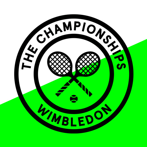
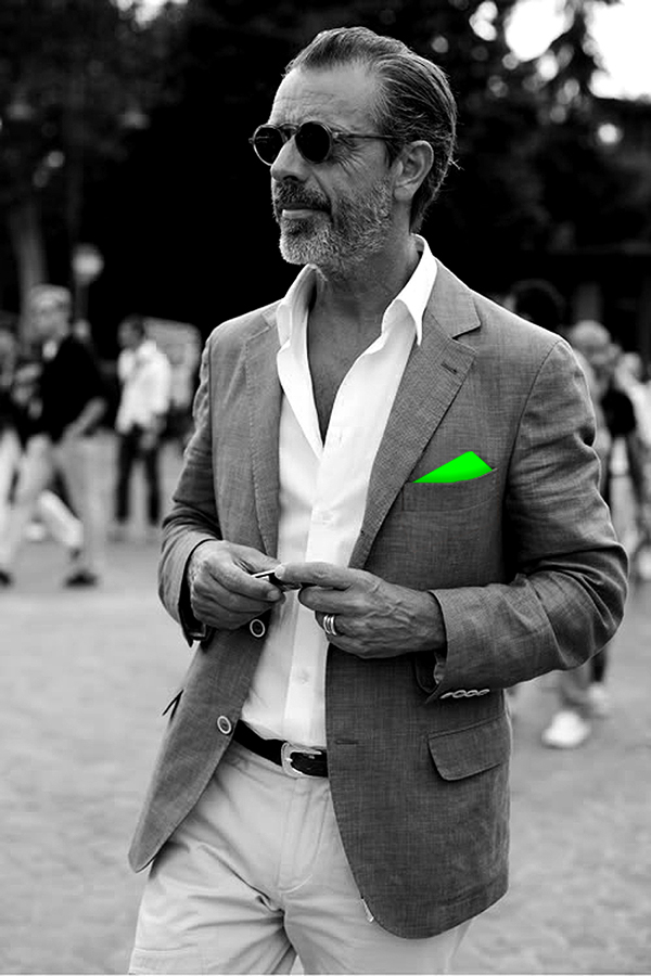
- A primary aim of this project was to gain as much use out of each product as possible, an example of this is theDynamic Logo.Instead of simply communicating one layer of information, the green backdrop changes organically to convey various forms of information such as temperature forecast, rain density, twitter trending, tv viewership and so on. This allows extra depth of information through no extra cost.Logo refinements are an evolution, instead of revolution. These include:- Increased kerning and pt size, to allow greated legibility at varying scales- Bolder lines to allow increased visibility- Correction of racket string orientation from 45 degrees to 90 degrees, adding realism.- Monotone colourway, to reduce costs from 3 colour plates, to simply one. Also allows dynamic features to shine.
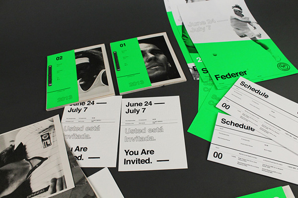
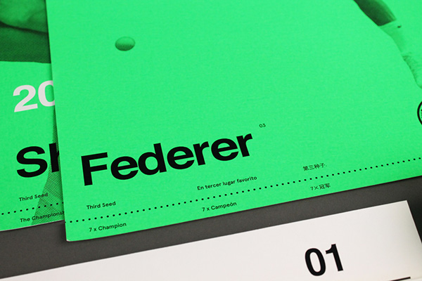
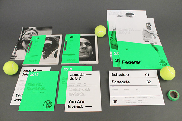
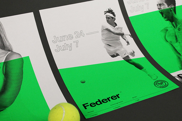
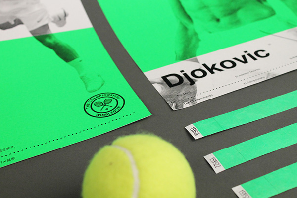
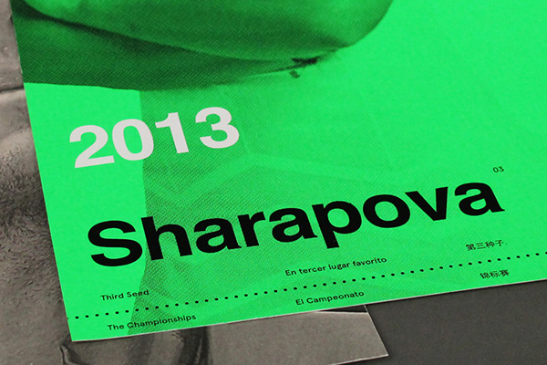
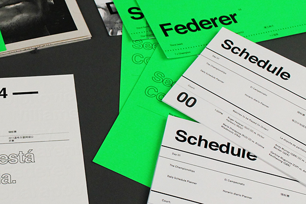
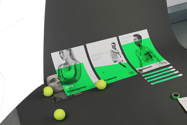
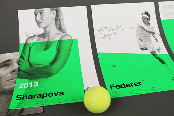
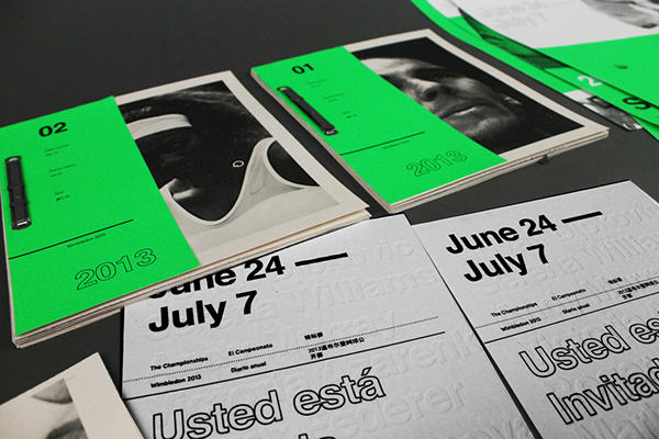
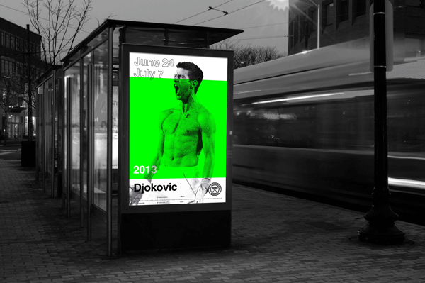
- Posters all communicate only necessary information with considered use of space and layout in order to create visual unity. Information communicated is date, venue, championships and information regarding player in question.
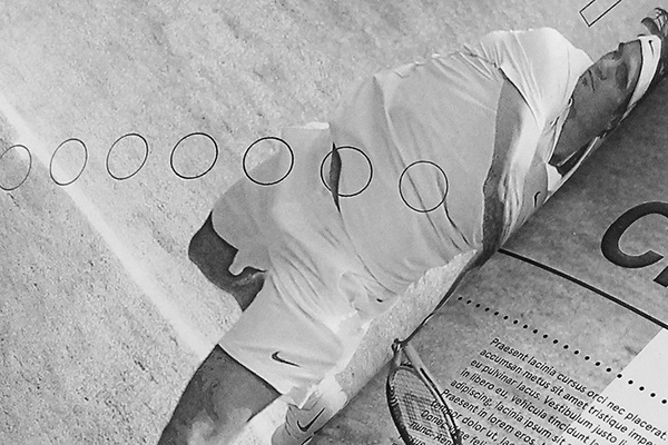
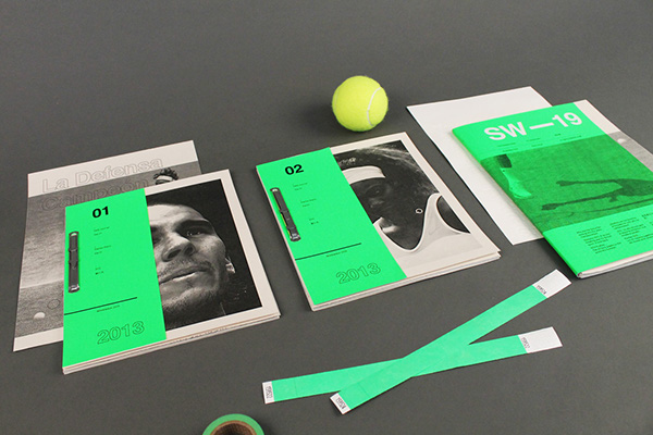
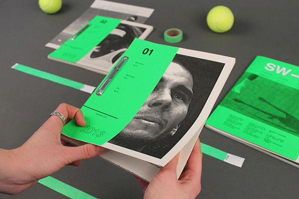
A focus of the project was to communicate individual players as unique characters with their own attributes, personality and skills - this is communicated through methods such as individual posters displaying name and tournament seeding. 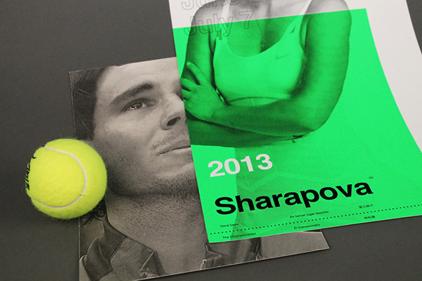
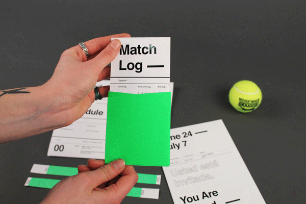
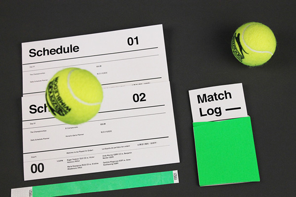
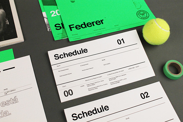
- Match Logs are pocket size schedules of matches to be played, focusing on specific courts. Match logs are a more traditional method of score tracking, insteas of mobile apps and push notification - giving the spectator a sense of contol and pacing of information.They also neatly tuck into your pocket for extra fashion points.
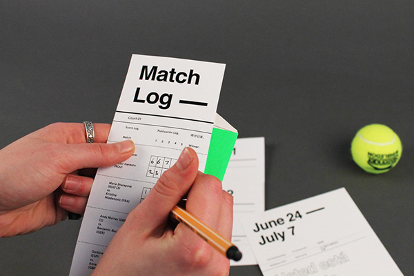
- They also neatly tuck into your pocket for extra fashion points...
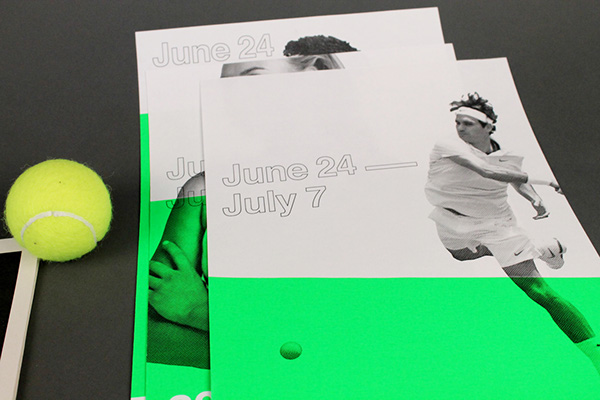
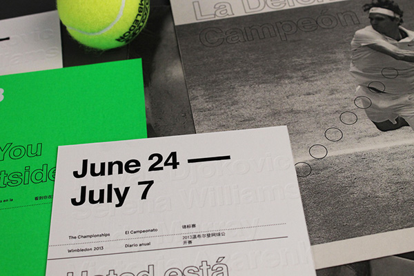
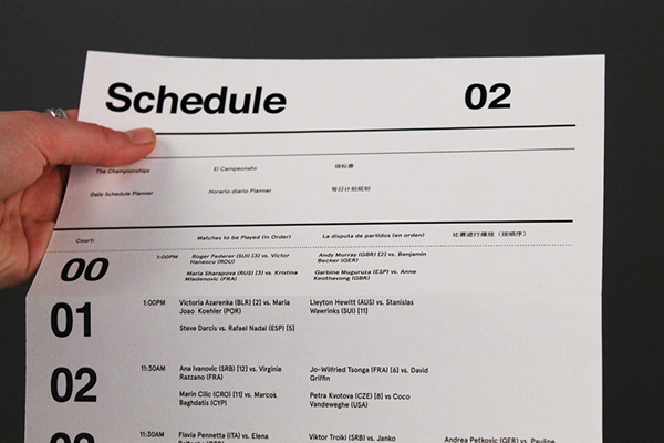
- All layouts focus on multilingual communication, in order to cater for an increasingly multicultural society and decrease risk of confusion - similar to Swiss design producing layouts in 3 languages to cater for a multilingual Swiss society.In todays Global society - the 3 largest languages are English, Chinese (Mandarin) and Spanish. Accounting for 25% of the worlds population. All layouts are therefore 3 times as likely to be understood than solely English.-Interesting point _ even though the project was passed around the world, English is till the dominant language in the layouts. Illustrating how English is quick becoming the default language around the world.
- Daily Journals to be produced in a cost-effective manner in order to be produced in bulk. Provide news and notable stories heading in to the days play, again focusing on collectable and usable print instead of using apps.
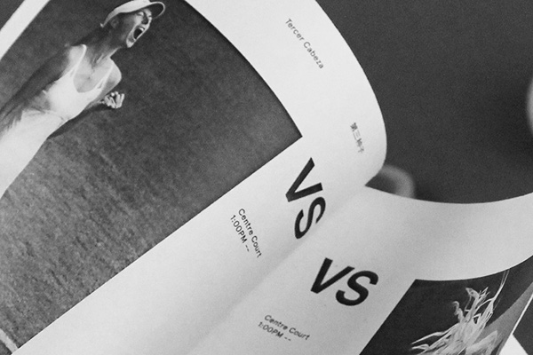
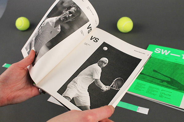
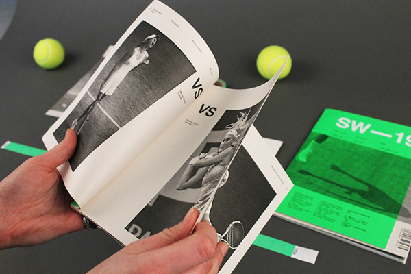
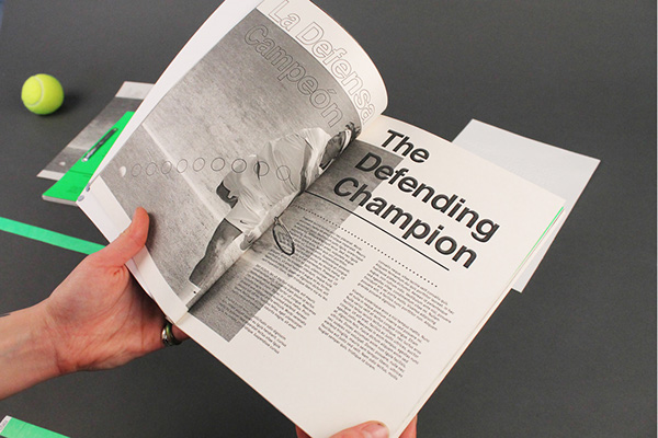
- VS. pages focus on each player individually, almost like heading into battle, a bold method of information to sell the tennis match as a battle. Use of monotone imagery throughout references Swiss style aspirations as its cost-effective and photography is an objective form of communication, unlike illustration in most cases.
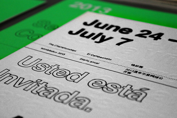
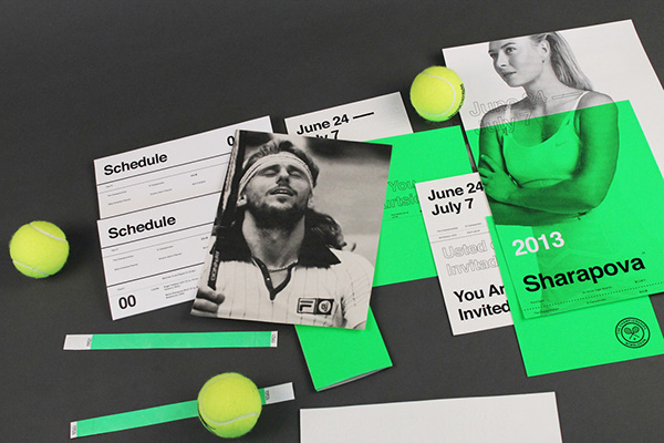
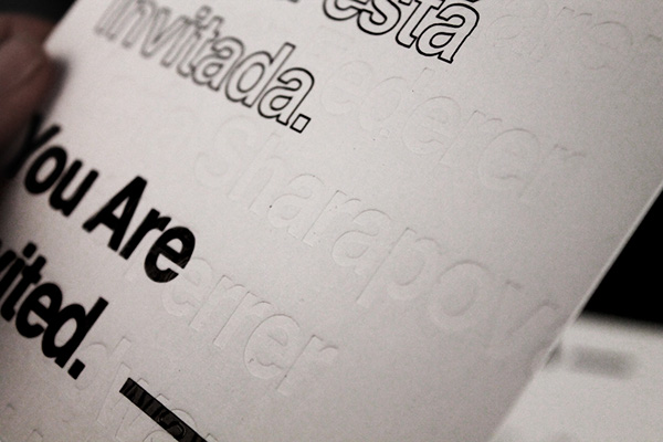
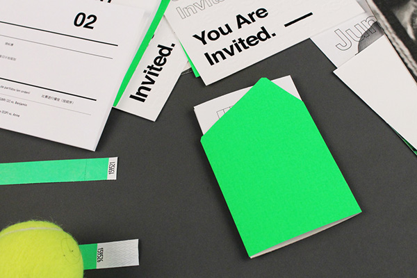
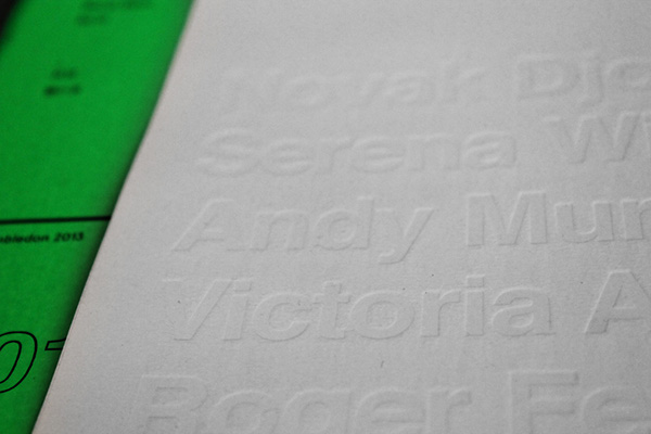
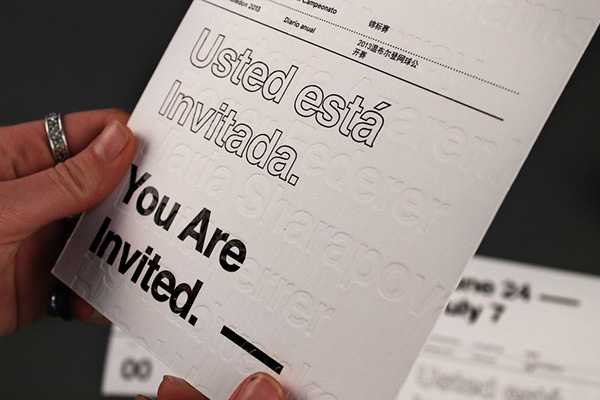
- Blind embossed special invites sent out to invite notable figures to the tournament. Embossing is cost-effective, as once a plate is made it's useable for life, and adds an extra layer of communication.As a bold, communicative design style adhering to Old Swiss Style principles, we felt the need to move further towards contemporary progression by adding touch - an esstential part of print. Traditional Swiss Style practitioners often focused purely on the aesthetic value, and not touch.
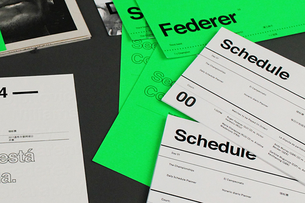
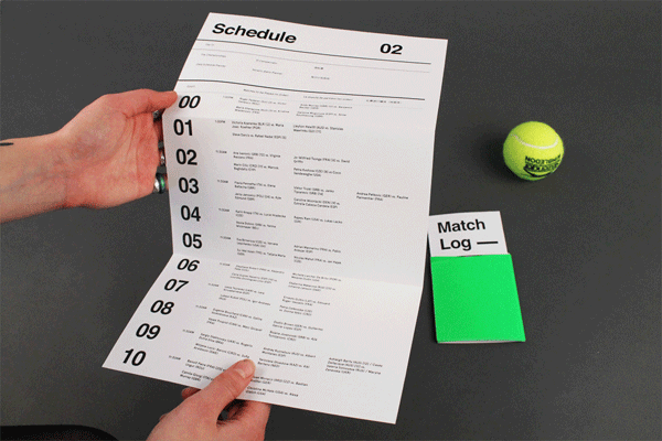
- Fold out Schedule planners produced daily and clearly communicate matches to be played by court. Illustrating the effectiveness of adhering to a tight grid, and type hierarchy in order to create clarity amongst confusion.
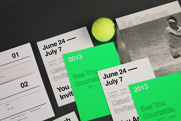
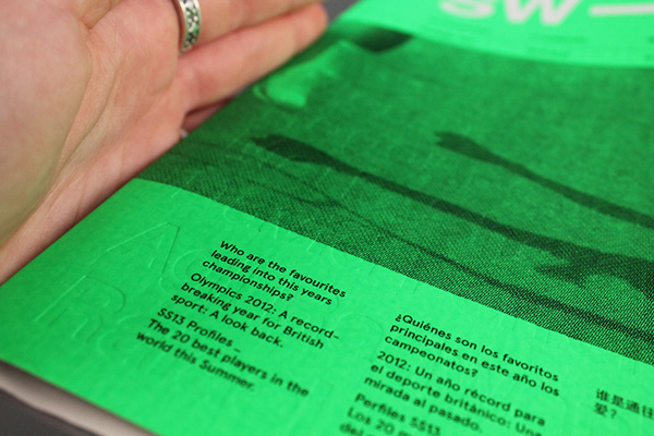
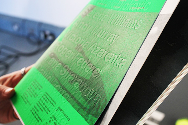
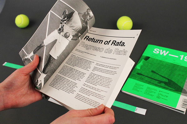
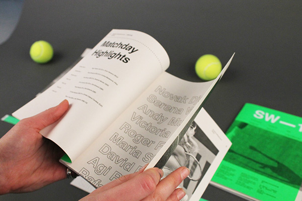
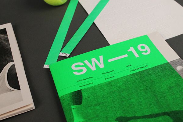
- SW - 19 would be an annual publication designed to be collectable and include more permanent articles and features heading into the tournament, in order to be more luxurious this is embossed with the top 5 male and female seeds heading into the tournament.SW - 19 is a reference to the WImbledon postcode, and is purposefully chosen to reference the sound of afashion collection to further emphasise a combination of glamour and sport design.
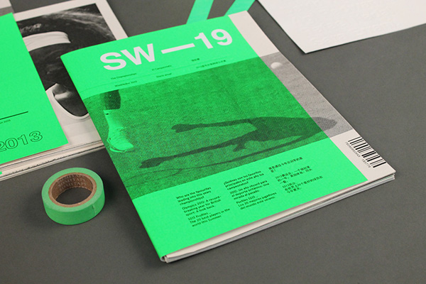
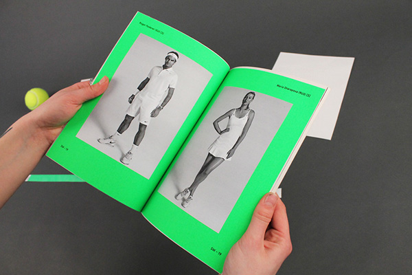
- Inner layouts of SW - 19 reference fashion lookbooks through individual photoshoots and profile pages, again focusing on the players as individuals.
-
Hopefully this project showcases the flexibility of adhering to a system of pure communication and bold use of primary colour in a cost-effective manner can still be succesful and appealing. Even when applied to something as traditional and iconic as Wimbledon.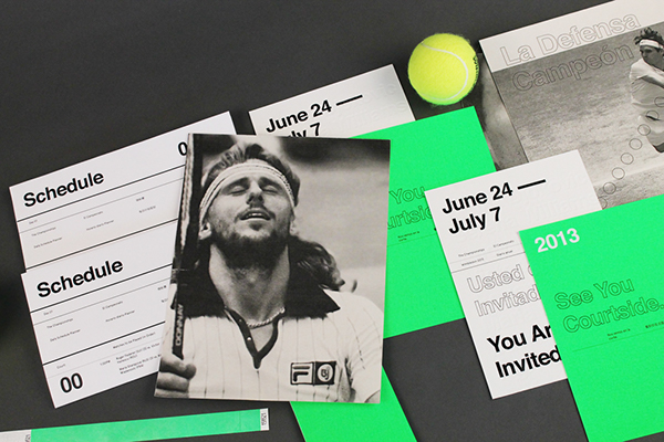
- Special Thanks to _Raimon GuiradoCeleste WatsonHong Sang Chan_ For being willing to collaborate and work on this_ This project is in no way affiliated with the Wimbledon Tennis Championships and exists purely within the confines of an education and conceptual context _
Friday, 17 January 2014
Practical: Wimbledon _ print photos
Subscribe to:
Post Comments (Atom)
No comments:
Post a Comment