I'm going to make a start on this and try and take my time with this, hopefully doing one lecture or two in each sitting so I can soak all the information in more. Hopefully I will take something away from it and produce a pretty useful catalog of designers for the future, instead of rushing through it.
~ ~ ~
MODERNISM
Herbert Bayer
Herbert Bayer was an influential Austrian American graphic designer. Heavily varied in his work, he also crossed over frequently and was a painter, sculptor and art director amongst other professions. Also a prominent member of the Bauhaus school of art and architecture up until the Nazis shut it in 1933.
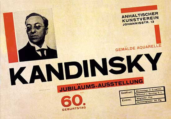
Bayer studied under Bauhaus artists such as Paul Klee, Moholy Nagy and Kandinsky. He developed his own visual style, based on minimalism, heavy use of grid, sans-serif typefaces and heavy use of lower case. He worked on a lot of Bauhaus publications.
Architype Bayer typeface by Bayer. Bayer reacted to the Germanic use of capitalisation for all nouns by abandoning uppercase.

Poster by Bayer, 1926. Heavy use of grid, space and simplicity. Focus is on minimalism and legibility.
"Just as typography is human speech translated
into what can be read, so photography is the translation of reality into
a readable image" - Bayer, 1000 Photo Icons by Anthony Bannon
Muller Brockman
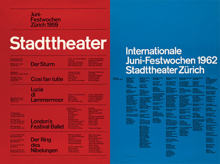
Muller Brockman was a Swiss graphic designer and teacher. Studied in Zurich. Muller Brockmans is recognised for his simple, minimal designs with a strong focus on communication and legilbility. Also his close associate with Aksidenz Grotesk, a modernist, geometric typeface which is highly legible and flexible, allowing it to be applied to most design with it's lack of 'character'. It can mould to any context. Helvetica was heavily inspired and influenced by Grotesk.
He was also a strong advocate on the grid system, publishing many books on the topic, such as 'Grid Systems in Graphic Design'
Really enjoy Muller's work, I like how he handles colour. Colour is something i've noticed drives a lot of my work and drives a lot of my reasoning for being a fan of something or for finding something aesthetically pleasing. He also handles imagery and balanced type and image very well too, as you can see here:
"The grid system is an aid, not a guarantee. It permits a number of
possible uses and each designer can look for a solution appropriate to
his personal style. But one must learn how to use the grid; it is an art
that requires practice." - Brockman.
Paul Renner
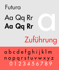
Paul Renner was a typographer and graphic designer. The reason why I've picked him as an example of a graphic designer associated with modernism is he designed the Futura typeface in 20's, a period which was at the height of modernism and modernity. It's also a typeface which is heavily geometric, with rigid widths and it's san-serif. It has appearance of efficiency and fowardness with the focus on function, before form. Renner tried to focus on the non-important decorative elements and focus on just what's needed and what is vital, another trait of modernism.

Futura, 1927. Paul Renner
An example of the diversity of the ways in which Futura can be used is the use of the typeface for movie posters, such as American Beauty
Gerd Arntz
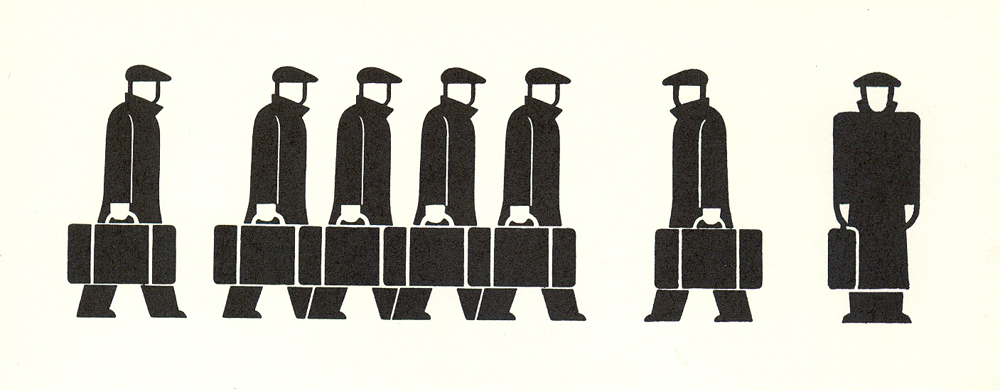
Gerd Arntz was a prominent graphic designer who produce a lot of work in the visual communication realm with a wide variety of isotype and iconography. I feel his work is modernist as it's highly sophisticated and intelligent in the way it's designed to get the message across in a matter of seconds. Communication is key with modernist graphic design.

He's also probably more famous for his woodcuts which were very influential in the way they used the 'stick figure' and pretty ahead of theit time. They dealed with social issues such as worker strikes and Nazi and Weimar Germany.
So clever the way he used just black and white, to create pretty detailed yet highly simplified illustrations.
He also did many infographics, which we worked closely with Neurath with.
Gerd Arntz "I was interested in depicting flesh and blood and sensuality. Unlike my previous prints, I did not fit the figures into an architectural construction anymore, but grouped them as one seamless composition." - Arntz
Otto Neurath
Otto Neurath was a philosopher who worked closely with Arntz and created Isotype. Isotype and iconography can sometimes be overlooked in todays world as it serves its purpose so well when it comes to signage in things like airports and on road signs, but it's a testament to how efficient the design is that no one looks twice at them, as they communicate so efficiently in the first place. These ethos and themes ring true with modernism and with Neurath's work. Efficiency and intelligent use of framing and colour is key.


No comments:
Post a Comment