EXAMPLES OF DESIGN//VISUAL COMMUNICATION
––––––––––––––––––––––––– within the public domain –––––––––––––––––––––––––
I think this kind of stuff is really cool, I like it because if you're walking in the right direction and manage to capture it when it all kind of works together perspectively, it'll definitely be eyecatching. I think this is in an airport
It combines this with more readily usable and more important unformation through nice typography on the walls which is liner and not using perspective. So the essential information is still there. it's colourful too, I love colour.
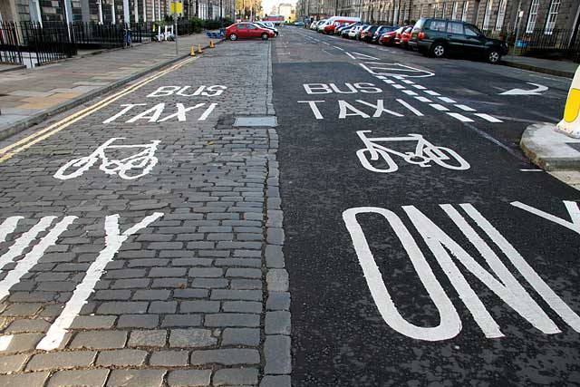
Road markings are often overlooked. Incredibly simple, probably alot of thought put into the colour and type choice, so that it's as effective at communicating as possible.
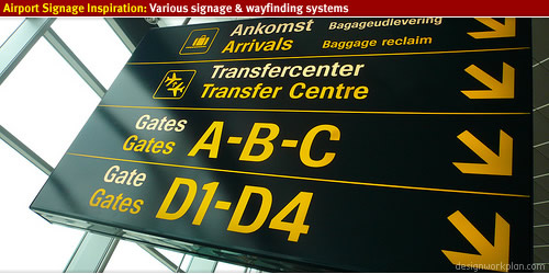
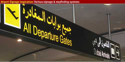
Airport signage
Dusseldorf
Copenhagen
Really effective use of icons/pictograms. Effectively put the point across, hard to really improve upon them or criticise stuff like this.
Dubai
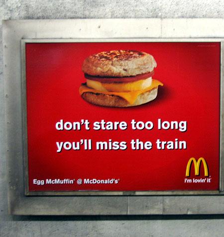
McDonalds billboard compaigns are pretty cool sometimes.
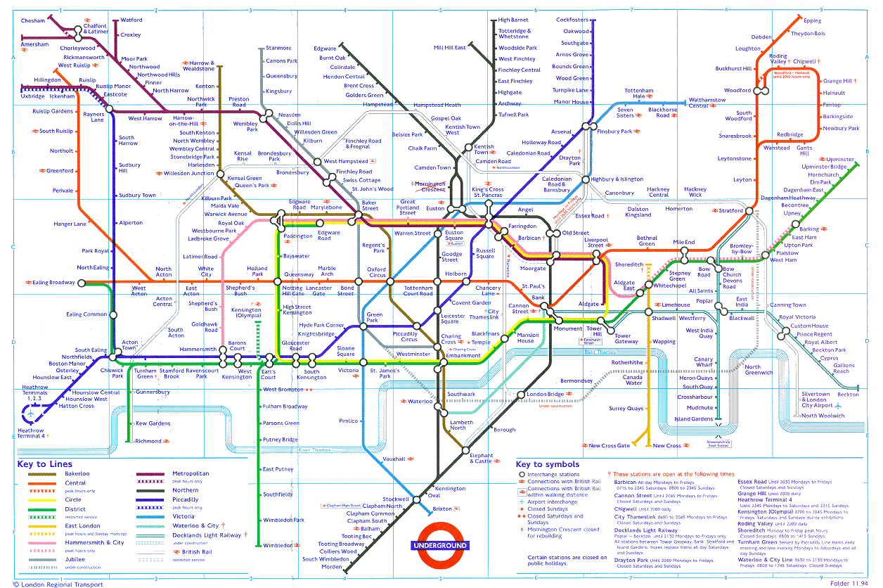
Tube maps, which you can see in booklets/guides/walls/posters/inside trains etc.
New York Subway







No comments:
Post a Comment