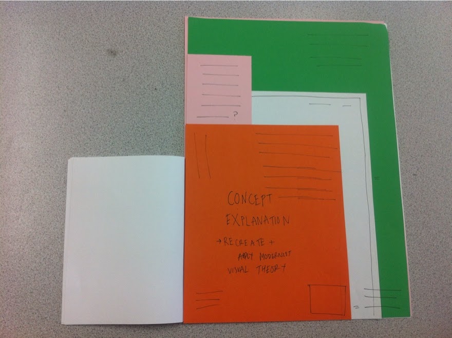
I made a mock-up yesterday to better gauge thei nteraction and format of the publication. In terms of my concept it's very simple, I'm applying fundamental design theory to existing design by recreating the poster in either the European or Japanese graphic design movement of the 50's onwards in the post-war period. Although both are modernist I feel they approached progressive design in a different way and I want to illustrate this.
I've been scratching my head in terms of how to make the use and interaction of the product befit the topic I'm covering, I was inspired by the Tokyo '60 Design Conference. I love the difference in colours, stocks and formats. I really enjoy the way it's all layered and geometric yet also so colourful and playful.

Beautiful design ! The main concept in terms of usability is to reference this and have the feeling of a variety of different products, formats and stocks somehow bound together to create this sort of scrapbook of visual debate between Europe and Japan. What I'd be referencing is also a very important event in Japanese graphic design history and bridged the gap between the rest of the world.
This is just a mock-up yet and I want to go to town more with the layering of formats and think about the colours and stocks more but I feel this is the best way to go, for my own visual development and for the brief.

With everything opened out on face value the information will be seamless throughout all the individual leafs, everything will line-up for example the title of the publication will run over the booklet and onto the stock underneath it creating an interesting effect.

Book is the first thing you'd read, this is more of the debate side with the layout and purpose of a standard book, I may have tipped in sections and little books within the book, this will be an extension of my essay laid out in a modernist format with facing pages in a separate layout, showing the conflict and agreeing elements between different takes on modernist design.

Once booklet is read you see the posters with a small cover which explains "How would X look if Europe (or a specific European designer) got their hands on it?" and similarly "How would X look if Japan (or a specific Japanese designer) got their hands on it?". The small cover will show the original design and the recreated poster underneath it.

.JPG)
Turning the small cover reveals a quote on the back of it which reinforces the design principles of that designer/movement and the recreated poster reveals itself.
.JPG)
Turn a poster to see another poster and cover which recreated the same original artwork.
It's almost as if the book is one product in itself which works as a book and the posters also form a sort of book. There will be a minimum of 6 posters, so at least 3 pieces of design will be recreated both in a European and Japanese design sensibility.
.JPG)
The issue for me at the moment is binding methods, tomorrow I'm going to discuss this with other students and see what they reckon. The issue is how I can bind a book to individual leafs (the posters) and still make the book function and not be tacked down and immobile.
////
I'm going to look into this more and give myself no more than a day to finalise exactly what I'm going to do and how it will be put together in terms of format and binding to find the best solution.
No comments:
Post a Comment