As part of a brief I'm working on for Hyde Park Picture House regarding working on a poster for a screening of The Shining, I've been looking into poster conventions and general elements I can combine and reference for my own poster. I especially found these examples useful:
##Existing Examples


I'm a bit love/hate when it comes to alternative posters, some are incredible and some are a bit 'me too' - the general trend which is all over the place is to take plot elements and simplify them to the extreme. For example there's an axe in the movie so let's just put an axe on the poster, at one point this might have been refreshing but now it's just tired and uninspiring. It looks great when it's done well but often a simplified poster can somehow make an amazing action packed movie just seem..dull.
I want to do something different with mine and capture more raw emotion.
##Past Posters

I wanted to really capture the almost Dr Jekyll and Hyde split personality of Jack Nicholson in the movie.

I loved this tagline "The tide of terror that swept America is here!" It's very over-the-top and a classic horror movie concept, often not seen on modern movie posters.

This classic poster is by one of my design heroes going by the name of Saul Bass.
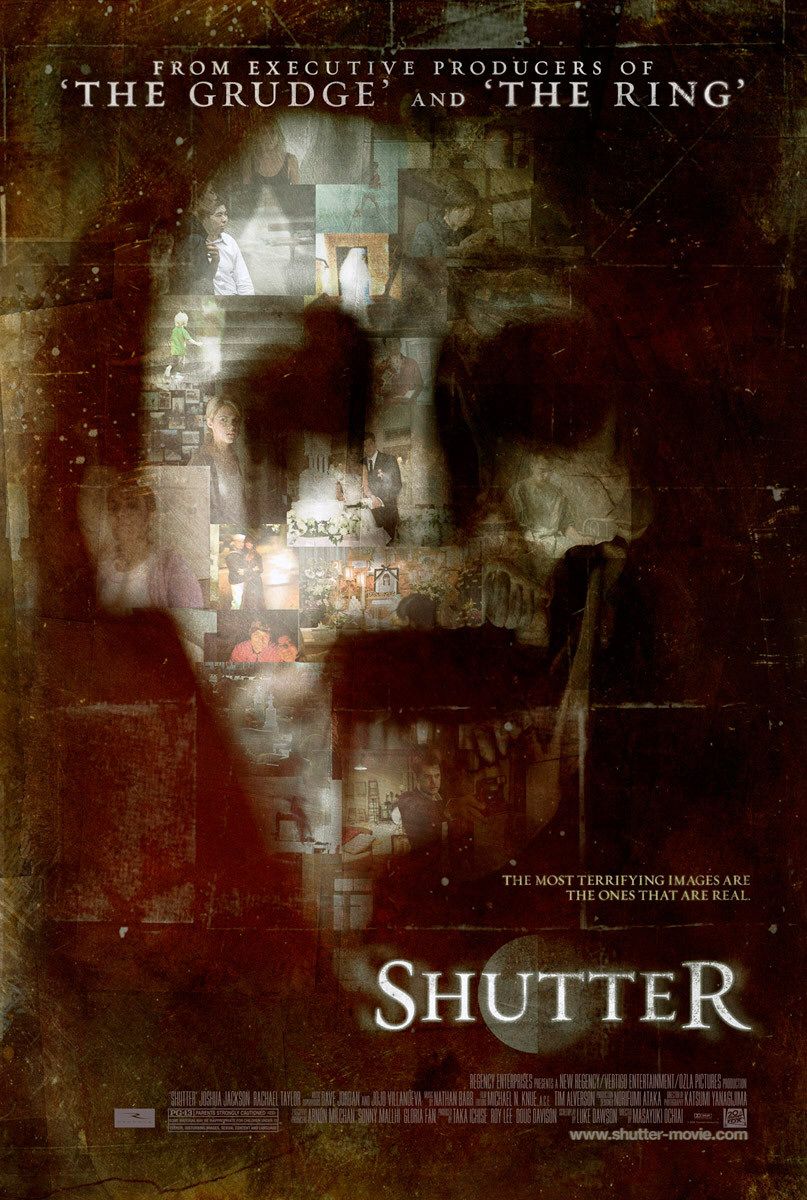
##Existing Horror Posters (modern)
Studying modern movie posters they're all strikingly similar and stick to a tried and tested formula. Big black backdrop, close up of a face or some kind of grizzly grimy weapon, text in contrasting colours such as red or yellow in a serif font.


Now if you compare these to horror posters of the past, the difference is striking..


The composition and choice of type was much more inventive and simple but more hard-hitting, no need for grungey brushes and weird colour pallets.
The taglines stood out to me and captured my imagination and sell the film to you.
I wanted to combine all the elements I liked and to create a new poster with touches of classic horror movie poster elements, these examples really helped to visualise the direction to go in.
No comments:
Post a Comment