- Branding & identity
- Packaging & promotion
- Publishing & editorial
- Information & Wayfinding
This resouce on e-studio was particularly useful to see definitions and useful links: http://estudio.leeds-art.ac.uk/mod/page/view.php?id=2283
In this post I will post up just web examples but hopefully for next weeks session I'll bring in and photograph primary and secondary sources I find too
Branding & Identity
Branding and identity is the perceived corporate image of the business as a whole and the identity form the visual aspect of the brand be it through logo/business cards/letterheads or any other visual products that help to put across the brand, what it does, where it's from, what it's called etc. From a graphical standpoint an effective form of branding and identity in my opinion is a project which gives you atleast a clue of what it does, where it's from and what it's called just from the visuals that accompany the brand.
Apple
I chose Apple as I think it's a very effective example of branding and the principles and type of mentality a company carries through it's output and business style. From the beginning, Apple has had the tagline "think different" and I think they perfectly target individuals into almost becoming part of the Apple family and enjoying, going about their lives, working and educating themselves much more effectively than with other products. It perfectly targets a creative person as they are THE industry tool in the creative industries and almost make it seem like you would produce better work and almost have a much better creative flow when using an Apple product. Not only that, they have a reputation of excellence, and almost a tribal and religious like following. There's no other tech company out there that has release days like Apple does with the excitement and buzz over a new phone. With people camping outside willingly and excitedly to spend hundreds and thousands of pound on some metal, essentially. Also the way their stores are inviting and not very 'stuck-up' even though the products are clearly luxury. For example a Ferrari store is a very luxury car, I'd feel pretty poor if I went in there, but going into the technology equivalent I feel very much at home and I'm invited to have a go on their products and talk to the staff. It's unique and they're brilliant at it.


Below is the Pizzarcade Restaurant identity by Ilan Lapides. I think it's a pretty effecitve idenity solution as it perfectly encapsulates what the restaurant is about through the identity and the way it visually communicates the brand and restaurant. The visual style nicely melds together the idea of gaming and an arcade atmosphere with a pizza restaurant. It also has a unique piece of packaging with a cool take on a pizza box, which instantly separates it from the rest of the pizza box crowd and automatically adds interest.

Coca Cola
Coca Cola is iconic and I think they do an effective job through their logo design, and colour schemes to make you instantly think of Coca Cola and their products. Sometimes even without the colour and just their embossed logo in the example below, we still know exactly what it is. Their iconic bottle shape is also very effective.


Matt Chase x US Postal Service
"Complete re-visualization of the USPS mail system, including logo, letterhead, business cards, packing tape, shipping labels, mailbox graphics, worker uniforms, stamps, stamp dispensers, notepad, weights & prices brochure, fleet vehicle graphics, front-of-store signage, newspaper advertisements and elementary school posters."
What I like most about this project is just how well thought out it is and how well it puts across the brand image which is proposed, of a retro/vintage aesthetic. The aesthetic also changes your opinions and view on their service and how they go about their business, you automatically think the company will be very friendly, courteous and effective as that's what we think of when we think of classic postmen like in the old movies and so on. I appreciate how in-depth it is too, right down to how the mailbox and uniforms will look.


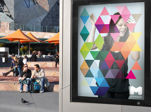
City of Melbourne
This is a collaborative and award-winning rebrand proposal of the City of Melbourne through it's branding/logo and identity design. I really like the vast improvement on the original it is, not only in visual interest but in how it has more effective concepts such as capturing different backgrounds and cultures and attraction. Basicallyj ust making Melbourne a more exciting and colourful place to visit just through the design and variations of the logo and identity. From billboards to tickets to prints the size of a building.


No comments:
Post a Comment