I thought I'd post up a collection of examples of work which in my opinion handle type and layout very well and effectively.
Predictions by Tim Wan
I think the type and grid layout in this works very well, I think there's a nice balance between headings, areas of focus and also the body copy throughout is consistent and well thought out. It flows nicely and your eye knows where to look.
Also in terms of stock I really like his use of different coloured stocks and using their natural colours to his advantage. The whole print could easily be done with a one colour ink + tints if he wanted to which is efficient and clever.
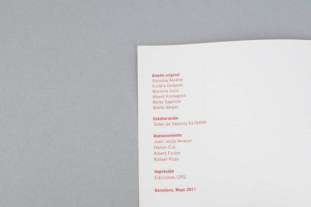
Marion Gulu - Dolores Magazine 2011
Dzucle
Lotta Nieminen
Peter Seitz - Braun letterhead


No comments:
Post a Comment