French New Wave Cinema of the 50s and 60s lecture (click)
Italian Vernacular Cinema lecture
F I L M T H E O R Y
Saul Bass
Saul Bass was a graphic designer and occasional filmmaker from New York. During his career he worked for some of the most famous filmmakers of the last century, such as Alfred Hitchcock and Stanley Kubrick. He also designed some of the most iconic logos of our time such as Kleenex and AT&T's logo. In relation to film theory, though, along with his movie posters such as the iconic Vertigo poster, he also did many film sequences. Probably the most famous film sequence is for 'The Man With The Golden Arm'. His work's very inspiring to me and I find his approach and insight, from the few interviews I can find of him very inspiring and a very refreshing approach to graphic design.
"I want everything we do to be beautiful. I don’t give a damn whether the client understands that that’s worth anything, or that the client thinks it’s worth anything, or whether it is worth anything. It’s worth it to me. It’s the way I want to live my life. I want to make beautiful things, even if nobody cares." - Saul Bass
"There is nothing glamorous in what I do. I’m a working man. Perhaps I’m luckier than most in that I receive considerable satisfaction from doing useful work which I, and sometimes others, think is good." - Saul Bass
Olly Moss
Olly Moss is a graphic designer based in the UK, he's only 24 years old but he's really gaining a massive following and most of it is down to the posters he makes for movies. He's had clients such as Studio Ghibli and LucasArts. The reason I've chosen to talk about him, even though he's not related directly to the Hitchcock, French New Wave cinema or Italian Vernacular cinema, I find his work to be very heavily influenced by the style of the 60s and 70s. He's especially inspired by Saul Bass, judging by his use of colour and very clever use of negative space. Most of his work tends to be posters for print/or posters for spreads/gigs etc. His work's always inspiring, hopefully I'll get that good one day, why not?
"People always ask how you justify doing work with pop culture. And it’s kind of a pretentious justification but if you look at classic art, a lot of it is religious and mythic iconography and symbolism. Now a days it’s a similar thing. It’s just instead of having Hercules, Athena and Apollo it’s Darth Vader and Optimus Prime. More stuff that you recognize, stuff that you have an instant connection with, stuff that stands for the same concepts." - Saul Bass


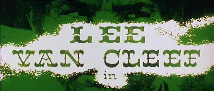
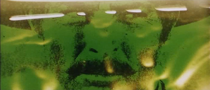
Iginio Lardani
Iginio Lardani was a self taught motion designer with a background in graphic design. He created a classic film title sequence for the spaghetti western'The Good, The Bad and The Ugly' in the 60s. The gritty monochromatic photos of the main characters and of archetypical "wild west" subjects are processed to look like the "most-wanted" photos as reproduced on posters and in 19th Century newspapers. To create the naturalistic motion of the stylized animated scenes with the galloping horses, Lardani probably used a rotoscoping technique for the effect.
LaBoca Design Studio
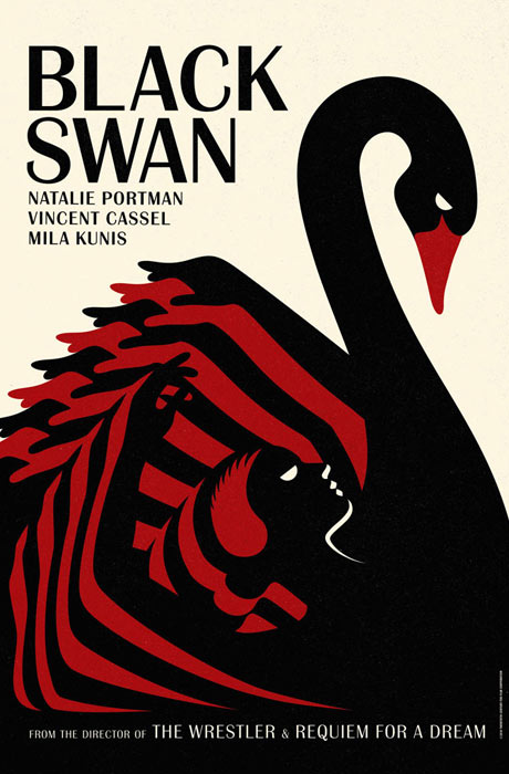
LaBoca are a British design studio who specialise in design fo the film, music and fashion industry. They produced a collection of poster for Darren Aronofsky's Black Swan movie, which in itself is an example of a modern-day Giallo movie. Giallo being the Italian word for 'yellow' and the term used for a certain style of film involving suspense, crime and mystery in a highly stylised manner. They seem heavily inspired by Polish and Czech posters of the 60s and reference ballet posters from the early 20th century to impressive effect.


Kurt Volk is a graphic designer who worked on Quentin Tarantino's and Robert Rodriguez's Grindhouse set of films. Rodriguez directed Planet Terror, while Tarantino directed Death Proof, both came as a pair and were views back to back with make-believe adverts for other films also in between. Some of which became fully fledged movies in their own right, like Machete and Hobo With A Shotgun. The reason I've picked them is because of their work on what was to be a revival of grindhouse movies, something we studied in our film theory lectures. Really love this style of work and I really love the grindhouse and blaxploitation era when it came to posters, the humour and tone of them is really interesting and Volk has referenced them really well.


2 of my favourites from Volk. Really love the colour, the composition, the texture he gives to it and the way he captures the grindhouse feel so well.


Hi,
ReplyDeleteI loved all of these posts. A lot of these things we have, but I got some really great ideas..........
Photographer Durban