Monday, 30 April 2012

STUDY TASK 5: COMMUNICATION

Relevant lecture notes


COMMUNICATION

Carolyn Davidson
Carolyn Davidson is an American graphic designer who is currently retired after 30 years of graphic design but she's definitely best known for designing the Nike logo which was a topic covered with the Nike Run technology and social communication aspect of brands nowadays in the communication lectures. She was paid only $35 at the time for the logo but did get some shares, which were around $850k. 


"I remember when he picked The Swoosh, he said, I don't love it but it'll grow on me." - Davidson referring to Phil Knight


Daim
http://www.loomit.de/version1/home.htm
Loomit's work ranges from wall to canvas and is known for having a lot of depth and a 3d feel to it. Daim collaborated with fellow graffiti artist Loomit and created a variety of pieces for use in the Vauxhall Corsa ad featuring graffiti, for a more urban and youthful brand image.


Bartle Bogle Hegarty (BBH)
http://www.bartleboglehegarty.com/
BBH is a British advertising agency with studios around the world. They've created some of the most notable ad campaigns of the last 30 years, with some of their clients including Vodafone, Levi Strauss, and Audi. In the lecture itself we were shown a guardian viral ad, which helped market The Guardian from an old print based mass media product to a new, forward thinking global media and news hub.


Sol Sender

Sol Sender is an American graphic designer and brand strategist probably best known as the logo designer for Obama's 2008 presidential campaign. I'm very interested in political graphic design and the great deal of thought put into the colours and layout in order to invoke a certain emotion from the viewer. I think graphic design on the whole was incredibly important to Obama's campaign, along with Shepherd Fairey's iconic 'hope' posters.

"We were looking at the “o” of his name and had the idea of a rising sun and a new day” - Sol Sender

“The sun rising over the horizon evoked a new sense of hope." - Sol Sender

“The strongest logos tell simple stories.” - Sol Sender


Steve Witmer
Steve Witmer is a graphic designer with close ties to Invisible Children and the  Kony 2012 campaign, helping design the posters and materials along with Tyler Fordham and Chadwick Gantes. Kony 2012 is a very slickly designed campaign to give the world and social media the power to make change and to make Kony famous, or more accurately more infamous. You can download kits, where you can plaster posters around etc. I think as a campaign it's brilliant, Invisible Children and it's history is patchy though.

"I had followed Invisible Children loosely for a couple years before I started working there, but what struck me back then was the excellence and emphasis they put on good design, especially compared to most non-profits. " - Steve Witmer

"The triangle is a symbol created to represent the current power structure being turned upside down. It stands for giving those a voice who have never had a voice." - SW


Sunday, 29 April 2012

STUDY TASK 5: ADVERTISING


Advertising|


Raymond Loewy
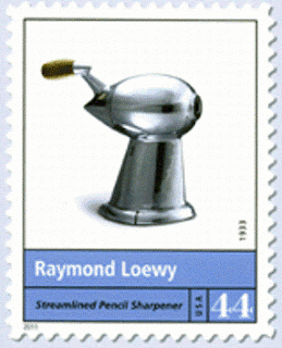
Raymond Loewy was an American graphic and industrial designer who specialised in mass market design, some of his most noted works are the Shell logo, Greyhound bus, the Coca-Cola bottle and Lucky Strike cigarette packages. Some of these such as the Shell logo and Lucky Strike cigarette packages are still largely unchanged 50 years later. His work often had a lot of thought put into user interaction, what they see first, what reaction they have and how effective it is. He was known for being very smartly dressed, often better dressed than the client. He was one of the first designers to really take big care of how he came across, and looking professional. His work kind of reflects this ambition. He was the first industrial designer to be on the front cover of TIME magazine.

"Loewy keeps one eye on the imagination and one eye on the cash register."

-- Charles Luckman, Lever Brothers


"Loewy has probably affected the daily life of more Americans than any other man of his time."

-- Cosmopolitan magazine, 1950


"People will turn to you, follow you, support you only as long as they are confident that you are doing your best." - Raymond Loewy

"If America wants to make "made in America" a symbol of excellence and worth. They have to make everything of high quality, otherwise the best." - Raymond Loewy


Hannah Hoch
There was a brief mention of the Dada cultural movement that ran through Germany during and after the first World War, peaking around the early 20's. The work consisted of various forms of art, from graphic design to sculplture and had a very anti dis-establishment and anti-art message around it all. They were the opposite to some of the advertising ethos that was discussed earlier on in the lecture. One of my favourite Dada artists is Hannah Hoch, one of the few female Dada artists and one of the few prominent female designers in Germany at that time. She used photomontage widely and along with Raoul Hausmann was one of the first pioneers of photomontage.

"I wish to blur the firm boundaries which we self-certain people tend to delineate around all we can achieve." - Hannah Hoch


Jonathan Barnbrook
Jonathan Barnbrook is another graphic designer I feel has a strong opinion on advertising in a social sense. Alot of his work has a social message. He's one of the 33 designers to sign the First Things First manifesto. He describes a major influence to his work 'an inner anger which is a response to all the unfairness that is in this world'. I feel hes probably got a strong opinion on the money driven, advertising world. He's also designed for Adbusters before.

"In the past we branded slaves. Now we are slaves to brands." - Jonathan Barnbrook

"was really into music when I was young. It was a form of rebellion and also a way to relate to the world. Record covers enhance your enjoyment of music, the graphics make the whole experience more meaningful in some way." - Jonathan Barnbrook

"Design shapes the environment. It helps us interact with and perceive the world. In fact, graphic design has always been a method of social change. Throughout history leaders have facilitated social change through the distribution of printed word. It really is that simple." - Jonathan Barnbrook


Jonathan Barnbrook
Jonathan Barnbrook is a UK based designer, who is known to produce work often with a social edge. He's one of the signatures on the First Things First 2000 manifesto, calling for design to be less commercial and be more unique and expressive and less money driven. He is also a well known font designer, he releases them through 'VirusFonts'. He describes as a major influence to his work 'an inner anger which is a response to all the unfairness that is in this world'.  He has stated his ambition to use 'design as a weapon for social change'

"In the past we branded slaves. Now we are slaves to brands." - Jonathan Barnbrook

"Design shapes the environment. It helps us interact with and perceive the world. In fact, graphic design has always been a method of social change. Throughout history leaders have facilitated social change through the distribution of printed word. It really is that simple." - Jonathan Barnbrook


Alan Fletcher
Alan Fletcher has been described by The Daily Telegraph(not that I normally care what they say)"The most highly regarded graphic designer of his generation, and probably one of the most prolific". In my mind he's a designer that I relate to with advertising as he has done so much mass market and commercial work for brands known worldwide and brands we interact with on a daily basis. He's one of the founders of Pentagram in 1972 along with other designers such as Theo Crosby. Pentagram itself is one of the largest graphic design studios in the world, designing some of the most widely seen ads in the world. 

His Reuters logo made up of 84 dots was designed in 1962 and retired in 1992, His V&A logo designed in 1989 still remains in use and in my opinion is still very sleek and probably will remain that way.

"I find going to bed and pulling my imagination over my head often means waking up with a solution to a design problem. That state of limbo, the time between sleeping and waking, seems to allow ideas to somehow outflank the sentinels of common sense. That’s when they can float to the surface. I find ideas often show up in the shower, or while I’m contemplating marmalade and toast and breakfast." - Alan Fletcher


George Lois
George Lois an American art director and graphic designer. He's probably best known for the 92 covers he designed for Esquire magazine. Lois' magazine covers were known to be a particularly provocative and memorable period for Esquire and the imagery it was associated with. Described by The New York Times as "George Lois' Esquire covers are considered among the most memorable propaganda imagery in any medium, and certainly the most provocative in the history of the magazine industry." Often called The Golden Age Of Journalism in America.

From 1962-72, Some of his subjects included Muhammad Ali to Germaine Greer. He's infamous nowadays for taking credit for other designers work, for example the VW 'Think Small' ad campaign has been the topic of debate.

“Creativity can solve almost any problem. The creative act, the defeat of habit by originality, overcomes everything.”  - George Lois

“If a man does not work passionately - even furiously - at being the best in the world at what he does, he fails his talent, his destiny, and his God.”  - George Lois

“Only with absolute fearlessness can we slay the dragons of mediocrity that invade our gardens.” - Goerge Lois