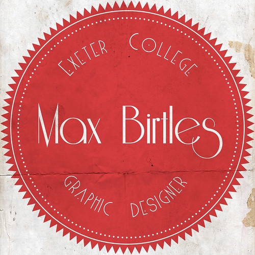
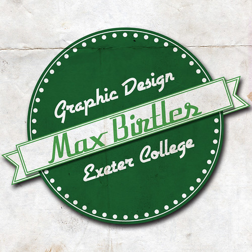
For my circular motif logo I've been working on, which you can see here
This is some reference imagery which I think partly helped and inspired the design of the logo. I really like the look of a sort of badge, I think it works well with monotone one ink colours and also in colour, I'll also try the variations in colour and see how it would work. I'll research into suitable colours for that. I tried to sway away from diamond imagery as there's a lot of brands that use diamonds as their logo and it would be difficult to differentiate from them.
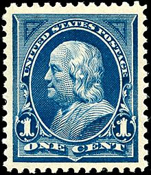
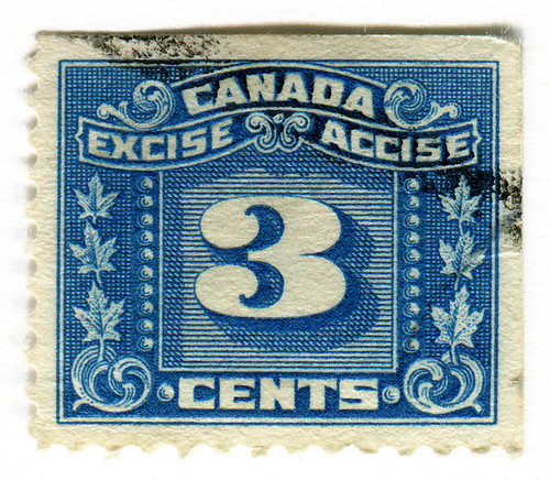
Here is some imagery which helped. A mixture sort of vintage, clear and legible inspirations. I also got the idea of the outer ring of little diamonds when I saw a postage stamp on a letter, weirdly enough. The edges of them gave me the idea with the kind of perforated edges.


Collection of modern vintage logos by Riley Cran...

Loads of really cool one colour retro logos from a Jordan Lloyd collection here: http://www.flickr.com/photos/jordanlloyd/sets/72157625725750162/
here are some from the collection


Really like the texture of these, maybe it's photoshopped but could easily be emulated by printing on nice textured stock. It almost looks coloured in by hand with a black marker, I like it when digitally printed stuff looks almost screen printed because of the stock.
No comments:
Post a Comment