From the list I'll pick one male, female and one group/company/agency that I particularly admire or am inspired by and pick 3 examples of work for each and tell a little about each artist, age, background etc.
Here is what I came up with, some off the top of my head and some where I knew the persons work but not their name, and some which I just discovered. (I find remembering names really hard!):
Anish Kapoor
Shepard Fairey
Jonathan Ive
Olly Moss*
Saul Bass
Bridget Riley*
Peter Saville
Sagmeister
Raymond Loewy
Alexander Rodchenko
Le Corbusier
Mies Van Der Rohe
Yuji Shinkawa
Andy Gilmore
Glenn Fabry
Burak Kaynak - makes stuff like this
GBH - For stuff like Puma Unity Initiative
Justin Van Genderen: Love his work like this
Big Active, for their work on stuff like the Mark Ronson cover
Happy F&B
FieldCandy
Radio*
Picasso
Van Gogh
Monet
Alex Kurbatov
*What I'm going to go with.
Male designer
Olly Moss.
A 24 year old UK graphic designer/illustrator who does work which basically I wish I had the crazy skills to make, most of his work makes me go wow, that's bloody clever - that's my favourite type of work in my opinion. The colours are always really strong and the execution is always quite simplistic in execution but the idea and concept behind it is always pretty smart and it is something I aspire to achieve with my work. I'm really into movies and especially movie posters and peoples takes on them, same with music covers etc and Moss has done loads and loads of it and I don't think I've seen one I dislike. Here are 3 pieces of his (from many) that I like. Very reminiscent of Saul Bass, also an artist I love. I love Red and both Bass and Moss seem to love it too.
It's hard to show him in a nutshell with just 3 pieces but these'll do for now..!
Female artist
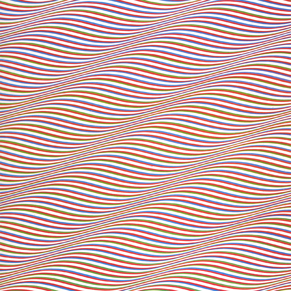
Bridget Riley. UK born artist/designer/painter born in 1931. Bridget Riley is an 'Op Art' icon, a type of art dealing with optical illusions and paying special attention to line, framing, format and colour. I just find it fascinating to be honest, I really like this sort of approach to design where you can create shapes, by basically not drawing them. She paints them too which is insane, I don't know how she does it without getting a migraine. I've recently just seen her work in person at Tate Modern and it made an otherwise pretty dull visit, worth it.
Design agency
Radio
Radio work out of Cape Town, South Africa, paying close attention to illustration, graphic design, iconography and advertising. I just really like their style on most of their stuff, the colours, again play an important part of their work. In my own work, I've hardly introduced colour as of yet which is abit disappointing, I've been focusing more on the actual design than colour seemingly but in the past I think colour has been one of my strengths and definite interested. Some of their stuff's really nice, check these out. They've got a really vivid, strong style of illustration. One using simple shapes in most cases, keeping it simple again.
Chat soonishh,
Abbas


No comments:
Post a Comment