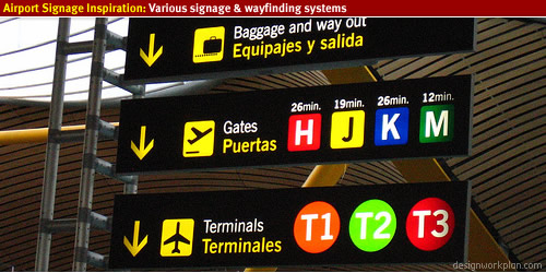
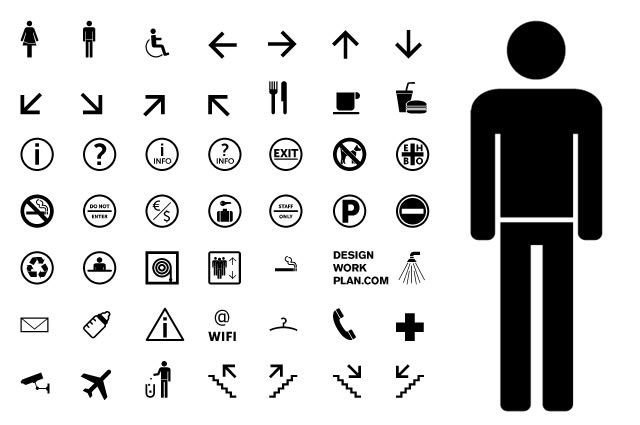
The pictograms need to work on their own too, on the image only poster. They need to be simple and concise. In my mind I like the idea of having an off lightbulb>brain>on lightbulb. It shows a hard situation, a bit of brainpower and bam! amazing solution. Could look quite cool just in the centre of a poster with lots of space around it to nice effect.
Anyways, check these out. So simple, so effective. Leads back to the semiotics stuff we've been doing with Fred in Design Principles.
I find all this stuff really interesting. At the end of the day, all they are, are very very simple shapes that hardly resemble photorealism yet our brain just registers them as something in a split second.
Like the sort of handprinted traditional quality to the last 2 pieces.


No comments:
Post a Comment