Source:
http://guity-novin.blogspot.co.uk/2011/07/chapter-42-swiss-grade-style-and-dutch.html
Really enjoyed reading this article, attached below some analysis and notes I took away from it, giving me a lot of useful bitesize information. This was much less daunting and a more efficient introduction rather than diving into in-depth books at this early stage
Notes + Analysis
------------------------------------------------------------------------------------------------------------------
Developed by Swiss designers developed mainly after the Second World War.
Armin Hofmann,
cold, emotionally sterile grid style; used structured layout. Unjustified type.
Very influential in 20th century, influenced a vast international audience. Hence the later name "International Style"
Designers saw design as part of industrial production - an underlying theme of modernism and searched for anonymous, objective visual information. Simple and efficient at information distribution.
Chose typefaces that were more industrial-looking rather than those made for books. Such as serif type?
Used photographs rather than illustrations. A progression of photomontage as laid out by the Dada movement originating in Switzerland and Germany?
The visual characteristics of the International Typographic Style consist of:
Neue Grafik - Founded by Josef Muller Brockmann which introduced Swiss style to America.
Believed cutting down design to the bare essentials would exaggerate and bring attention to the core message of the work.
JMB first studied design when he enrolled at Zurich Gewerbeschule.
Muller-Brockmann often used silkscreen , letterpress and lithography.
As demonstrted in the Musica Viva stuff - a series of concert posters for Zurich Tonhalle in 1951
JMB's shapes may look abstract but they had a lot of logic and subtlety to them. For example, his Beethoven poster shapes were supposed to portray Beethoven's music through a series of concentric curves...

Main contexts for MB's design was local Swiss stuff, posters ads, brochures and exhibitions - more event and experiential related and not product related clients.
The influence of Swiss design across to America, for a more consumerist approach. Led by Paul Rand.
From 1967 JMB was European design consultant for IBM.
Realises himself Swiss design, specifically his can be seen as boring, admits it himself.
" Of course, the world would have become a boring place should all posters have adopted the Swiss grid style. However, we have to remind ourselves that when these posters appeared on the scene their geometrical aesthetics were quite novel and rare."
My opinions exactly on the whole minimalistic approach to design, I feel the context and objective of the brief should be important. Some designers are obviously influenced by Swiss and modernist design and just make the world look boring and stripped down - these probably won't the main objectives of the real Swiss designers , it was a certain point in time.
Max Bill ___
One of the main originators and pioneers of the Swiss design development, Max Bill studied at Bauhaus under teachers such as Kandinsky and Paul Klee. Moved to Zurich in 1929
http://guity-novin.blogspot.co.uk/2011/07/chapter-42-swiss-grade-style-and-dutch.html
Really enjoyed reading this article, attached below some analysis and notes I took away from it, giving me a lot of useful bitesize information. This was much less daunting and a more efficient introduction rather than diving into in-depth books at this early stage
Notes + Analysis
------------------------------------------------------------------------------------------------------------------
Armin Hofmann,
cold, emotionally sterile grid style; used structured layout. Unjustified type.
Very influential in 20th century, influenced a vast international audience. Hence the later name "International Style"
Designers saw design as part of industrial production - an underlying theme of modernism and searched for anonymous, objective visual information. Simple and efficient at information distribution.
Chose typefaces that were more industrial-looking rather than those made for books. Such as serif type?
Used photographs rather than illustrations. A progression of photomontage as laid out by the Dada movement originating in Switzerland and Germany?
The visual characteristics of the International Typographic Style consist of:
- Assymetricaly laid out information within a tight and mathematical grid giving visual unity between type, image and clear space
- Clear and factual information. Sidetracking pretentious advertising and exaggerated commercial stuff. - Difference to the context of American modernist design?
- Sans-serif type, justified to the left, ragged right
- Designers believed sans-serif typefaces symbolised a progressive age. Almost rebelling against the past and rejecting old dead weight because of new technology. What is the future then?
Ideological principles of the work were:
- Design is socially important and worthwhile
- No room for eccentricity.
- A scientific approach.
- A well-defined and logical solution to the problem.
- Designer is a visual communicator and not an artist.
- Designer acts as a reliable transmitter of information members of society.
- Achieve clarity and order.
Neue Grafik - Founded by Josef Muller Brockmann which introduced Swiss style to America.
Believed cutting down design to the bare essentials would exaggerate and bring attention to the core message of the work.
"I have always aspired to a distinct arrangement of typographic and pictorial elements, the clear identification of priorities. The formal organisation of the surface by means of the grid, a knowledge of the rules that govern legibility (lines length, word and letter spacing and so on) and the meaningful use of colour are among the tools a designer must master in order to complete his or her task in a rational and economic matter.The greatest works of art impress through their balance, their harmony, their proportions, all of which can be measured. That is one of the reasons why paintings, sculptures and buildings that are thousands of years old – by the Egyptians, Chinese, Assyrians and so on – are still fascinating to us today." - Muller-Brockmann
JMB first studied design when he enrolled at Zurich Gewerbeschule.
Muller-Brockmann often used silkscreen , letterpress and lithography.
As demonstrted in the Musica Viva stuff - a series of concert posters for Zurich Tonhalle in 1951
JMB's shapes may look abstract but they had a lot of logic and subtlety to them. For example, his Beethoven poster shapes were supposed to portray Beethoven's music through a series of concentric curves...

Easily a one colour silkscreen on stock, shapes also control where your eyes go, adds balance and sort of closes in on the information.
Main contexts for MB's design was local Swiss stuff, posters ads, brochures and exhibitions - more event and experiential related and not product related clients.
"In my designs for posters, advertisements, brochures and exhibitions, subjectivity is suppressed in favour of a geometric grid that determines the arrangement of the type and images. The grid is an organisational system that makes it easier to read the message...The grid is an organisational system that enables you to achieve an orderly result at a minimum cost. The task is solved more easily, faster and better. It brings the arbitrary organisation of text into a logical system in keeping with the conflict. It can demonstrate uniformity that reaches beyond national boundaries, a boon to advertising from which IBM, for instance, has profited. Objective-rational design means legible design, objective information that is communicated without superlatives or emotional subjectivity." - Muller-Brockmann
From 1967 JMB was European design consultant for IBM.
Didn't want symmetry because fascists liked it?! Political conditions influencing the recognisable Swiss styles, exactly the kind of interesting stuff I've been looking for.
"Symmetry and the central axis are what characterise fascist architecture. Modernism and democracy reject the axis... I have taken my love of order to the point of manifest boredom, producing design solutions which are valid but deadly boring. Thanks to the passage of time, I am now just about able to examine my posters for the Zurich Tonhalle to discover why some are better than others. I am amazed how many are bad. The Beethoven poster is good, also the “Musica Viva” poster of 1970 with the green lettering on a blue background and the two Tonhalle posters of 1969 and 1972 with the rhythmic type." - Muller Brockmann
Realises himself Swiss design, specifically his can be seen as boring, admits it himself.
" Of course, the world would have become a boring place should all posters have adopted the Swiss grid style. However, we have to remind ourselves that when these posters appeared on the scene their geometrical aesthetics were quite novel and rare."
My opinions exactly on the whole minimalistic approach to design, I feel the context and objective of the brief should be important. Some designers are obviously influenced by Swiss and modernist design and just make the world look boring and stripped down - these probably won't the main objectives of the real Swiss designers , it was a certain point in time.
Didn't like Brody's typeface experiments which were just as expressive and communicative as posters themselves, believed in objectivity and uniform typefaces.
"Some set themselves the task of making typography so unreadable that it is almost like a picture puzzle. The illegibility is then sold as an artistic project. I wouldn’t read something like that unless I had to. " - Muller-Brockmann
Max Bill ___
One of the main originators and pioneers of the Swiss design development, Max Bill studied at Bauhaus under teachers such as Kandinsky and Paul Klee. Moved to Zurich in 1929
In 1950 Max Bill + Otl Aicher founded the Ulm School of Design in Germany - as a sort of successor to Bauhaus. Notable for it's education of semiotics. Pretty much a first.
Semiotics = Objectivity for the masses and language barriers, perhaps experienced in Switzerland?
Allianz Collective includind designers suchas Richard P Lohse, Max Bill focused on rejection of avant-garde, subjective and abstract art.
Lohse formulated his conception of constructive painting, a style that was highly structural. In the words of Fr. W. Heckmanns;


Original Article
------------------------------------------------------------------------------------------------------------------

After the second world war the Swiss Grid Style, also known as the International Typographic Style was developed by Swiss designers, such as Armin Hofmann, Josef Müller Brockmann, Max Bill, Richard P Lohse, Hans Neuberg, and Carlo Vivarelli who began to experiment with typography and photo-montage. Characterized by a cold, emotionally sterile grid style; they used structured layout, and unjustified type, that became very influential in the mid twentieth century and influenced a vast audience. These pioneering graphic artists saw design as part of industrial production and searched for anonymous, objective visual communication. They chose photographic images rather than illustration, and typefaces that were industrial-looking rather than those designed for books.
In short, the visual characteristics of the International Typographic Style include:
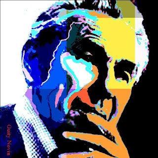
Josef Müller Brockmann was born in Rapperswil, Switzerland in 1914 and studied architecture, design and history of art at the University of Zurich and at the city’s Kunstgewerbeschule. He began his career as an apprentice to the designer and advertising consultant Walter Diggelman before, in 1936, establishing his own Zurich studio specialising in graphics, exhibition design and photography. According to his own account;

As a graphic designer, Müller Brockmann's skills included letterpress, silkscreen, and lithography. His geometric style was demonstrated in “Musica viva”, a series of concert posters for the Zurich Tonhalle in 1951. It is arguably claimed that his work was an adaptation of concrete art; which had been described by Theo van Doesburg around 1930, as works of art that are created by means of art's most genuine means of composition and principles, entirely doing without allusions to phenomenon of nature and their abstraction. New realities were supposed to be created by forming colors, space, light and movement.
The style had to incorporate mathematical methods of spatial organization into graphic work, which drew on the language of Constructivism to create a visual correlative to the structural harmonies of the music. Müller Brockmann's 1955 poster, Beethoven, was supposed to portray Beethoven's music through a series of concentric curves, and has been offered as an example such an adaptation, and this assertion had been accepted at its face value by many pundits, who were impressed by the novelty, elegance and the simplicity of design. As Müller Brockmann has stated:


From 1967 he was European design consultant for IBM. He is the author of The Graphic Artist and his Design Problems (1961), History of Visual Communication (1971), History of the Poster (with Shizuko Muller-Yoshikawa, 1971). Nevertheless, Müller Brockmann's work was rigid and soulless, suffering from certain self-imposed restrictions of the Swiss style, and dogmas such as the rejection of symmetry since fascists had liked it! He has said:


Müller Brockmann was totally dismissive of Brody's powerful artistic impact. The fact that not all viewers are of commercial types, and not everybody is concerned with profit maximizing attitudes that just require to get the information in an efficient and cost effective manner; the fact that there are also viewers that are interested in looking at a poster's typeface from an artistic view point and reflect on them, which in the process may also convey the message of an advertisement appears to have been totally alien to him. He has said;

Max Bill (1908–1994), was born in Winterthur, Switzerland. An architect, painter, typographer, industrial designer, engineer, sculptor, educator, and graphic designer, Bill was initially a student at the Kunstgewerbeschule and apprenticed as a silversmith before beginning his studies in 1927 at the Bauhaus in Dessau, Germany, with teachers such as Wassily Kandinsky, Paul Klee, and Oskar Schlemmer. Bill permanently settled in Zurich, Switzerland, in 1929, and in 1937 became involved with a group of Swiss artists and designers named the Allianz. The Allianz group advocated the concrete theories of art and design and included Max Huber, Leo Leuppi, and Richard Paul Lohse.
In 1950, Max Bill and Otl Aicher founded the Ulm School of Design (Hochschule fur Gestaltung-HfG Ulm) in Ulm, Germany, a design school initially created in the tradition of the Bauhaus and that is notable for its inclusion of semiotics, the philosophical theory of signs and symbols, as a field of study. Bill was of the view that "It is possible to develop an art largely on the basis of mathematical thinking." Over, the 1967-71 period, Bill taught at the Staatliche Hochschule fur Bildende Kunste in Hamburg where he was the chair of environmental design. As a graphic designer, he enthusiastically embraced the tenets and philosophical views of this modernist movement. The majority of his graphic work is based solely on cohesive visual principles of organization and composed of purist forms—modular grids, san serif typography, asymmetric compositions, linear spatial divisions, mathematical progressions, and dynamic figure–ground relationships.


Richard Paul Lohse (1902-1988) was born in Zürich (Switzerland) in 1902. In 1918 he joined the advertising agency Max Dalang where he trained to be an advertising artist, but in his artistic career he started with figurative works and gradually moved to post-cubism style. Lohse worked for the Max Dalang agency until 1927, where he became interested in the international avant-garde movements in both its artistic and political aspects. In 1937 Lohse, a key figure in the "Swiss School", and Leo Leuppi joined forces to establish Allianz, an association of Swiss modern artists, promoting publications, exhibitions and the dissemination of avant-garde art. He collaborated with Max Bill and Verena Loevesberg in the Zurcher Konkrete group, which was affiliated with Allianz. In 1938, Lohse and Irmgard Burchard, his first wife, organise the "Twentieth Century German Art" exhibition in London. Soon after Lohse joined the resistance movement where he met his second wife Ida Alis Dürner. In 1942 Lohse formulated his conception of constructive painting, a style that was highly structural. In the words of Fr. W. Heckmanns;


Armin Hofmann was born in 1920 in Winterthur, Switzerland. During the 1937-39 period, Hofmann studied at Kunstgewerbeschule in Zürich and apprenticed as a lithographer until 1943. From 1943 until 1948 He worked as lithographer in Basel and Berne and in his own graphic atelier. In 1946, Hofmann joined the Allgemeine Gewerbeschule (AGS) in Basel, where he and Ruder established a world renowned advanced course in graphic design.


Kenneth Hiebert, a former student of Hofmann; recalls that in the early sixties, Hofmann would occasionally bring in a Cassandre or Stoecklin poster and perfunctorily tack it to the wall. When the students cringed at this apparent maltreatment, Hofmann would say, “A good poster can take it.” What he really meant was that the posters were not intended as museum pieces but as things that should weather the harsh treatment of the streets. In the words of Paul Rand


Born in Basel, Switzerland in 1930, Karl Gerstner was a painter and a graphic designer, who studied design at Allgemeine Gewerbschule in Basel under Emil Ruder. In 1959, he and Markus Kutter confounded Gerstner & Kutter a design agency, which later when the architect Paul Gredinger joined them changed its name to GGK.

Gerstner's theory of ‘The Colour Form Model' presented in his book, The Forms of Colour is one of his most significant contribution to graphic design. Inspired by the rich and colorful patterns of a Moroccan craftsman art, in this book Gerstner explored the multifaceted and intricate relationships between colour and form, as the basic structural components of Islamic art. Analyzing graphical interrelationships among various dimensions of colour spaces and formal systems of perspective, topologies, fractals and so on he framed his theory in the context of Wilhelm Ostwald's 1922 rational theory of forms, which provides a seemingly unlimited mathematical base for formal variations.

Gerstner discussed the work of a like-minded mathematician/artist, Hans Hinterreiter, who as an early adherent to Ostwald's theory, adopted deconstructive style of painting, experimenting with forms and colors, based on laws of "color organ and form." Hinterreiter was also inspired by the Moorish interpretation of Islamic ornamentation of the Alhambra after his 1934 trip to Spain. Presenting his own colour-form theory, Gerstner assessed Kandinsky’s idiosyncratic metaphysical assertions on the correspondence between colour and form (square=red, triangle=yellow, circle=blue) and suggested his own system of ‘Colour Signs’. Using computer programming, he developed a system of new primary forms, such as astroids, diagons and sinuons and discussed their possible correspondence with aural and tactile sensory modes. Gerstner's book ‘Designing Programmes’ 1964 was a manifesto for system orientated design, which he described as ‘programmes’. He defined a design ‘program’ as a set of rules for constructing a range of visual solutions, and connected his methodology with the new field of computer programming and presented examples of computer generated patterns that were made by mathematically describing visual elements and combining them according to simple rules.
Gerstner’s typographic experiments with unjustified ragged-right text(Hollis 2002), and his proposed Integral Typography which extended Max Bill’s ideas on typography (Müller-Brockman and Müller 2000) have also been influential. Like the Italian futurists, Gerstner believed that typography can greatly contribute to the actual discovery of meaning with its whole impact to be greater than the sum of the words and the meanings.

Hans Neuburg (1904 – 1983) was born in Grulich, Austria-Hungary (today Czechoslovakia). at the age fifteen he enrolled at Orell Füssli AG in Zurich and graduated in 1922. After graduation he worked at various positions in advertising, freelance graphic design, and magazine editor. Over the 1958-65 he and is fellow artists Richard Paul Lohse, joseph Müller-Brockmann and carlo vivarelli established “Neue Grafik” magazine. After a brief two years period assuming the directorship of the Gewerbemuseum in Winterhur in 1962-64 during which he also taught at theHochschule für Gestaltung in Ulm, and writing a number of books including Graphic Design in Swiss Industry (1965), Publicity and Graphic Design in the Chemical Industry (1967) and Conceptions of International Exhibition (1969), he moved to Ottawa, Canada, to teach at Carlton University, School of Industrial Design in 1971.


The concept of the total grid has been the brainchild of Wim Crouwel, a dutch graphic designer, born in 1928. He is one of the five founders of Total Design, a multi-disciplinary design studio in the Netherlands. Crouwel studied fine art in Groningen before moving to Amsterdam in the early 1950s where he initially worked for an exhibition design company. Because of his interest in architecture, and his spatial sensitivities he applied for commissions for cultural institutions, such as the Van Abbe Museum in Eindhoven in 1956, and the Stedelijk Museum in Amsterdam shortly afterwards for which Crouwel was solely responsible to develop an identity by posters and catalogues. It was at the Stedelijk that Crouwel created his Neu Alphabet, an unconventional typeface based on grid system.

In 1963 Crouwel founded Total Design, a multi-disciplinary design agency, that its hallmark was modular structuring and grids. With a systematic approach to design projects, it created the identity for a large number of Dutch companies including some multinationals like IBM and Olivetti. Total Design altered the visual landscape of the Netherlands throughout the 1960-70 period. In the 1970s Crouwel designed the Dutch Pavilion for the Osaka World Fair, as well as numerous postal stamps for the Dutch post office and a controversial redesign of the telephone book using only lowercase letters.


Crouwel's typeface was constructed using only horizontal and vertical lines creating an alphabet of all lowercases. Although only half of the letters were recognizable, with the emergence of personal computers, his modern typeface was particularly aimed at digital systems in 1967. However, for many Crouwel's typeface appeared illegible. It challenged the design establishment, but Crouwel was happily engaged in the ensued controversy and readily confessed that he attaches a higher priority to visual aesthetics relative to functionality. Crouwel has stated;

His new typeface was redrawn by Brett Wickens and Peter Saville for the Joy Division album, ‘Substance’ in the late 80s and then digitized and made available for use in 1997 by The Foundry. Crouwel designed a number of other fonts including Gridnick, an appropriate reference to his use of grid systems and Mr. Gridnick became Crouwel’s endearing nickname. ----

The graphic designs of the Italian graphic designer couple, Lella Valle and her husband Massimo Vignelli, are also based on concept of total design in the confine of a grid. Born in Udine in 1936, Lella Valle studied architecture, and met Massimo Vignelli who also studied architecture in Venice, in the 1950s. The couple moved to to the US during the 1958-1960 period, where Lella Vignelli worked in New York for Skidmore, Owings & Merrill and Massimo Vignelli taught at the Chicago Institue of Design. In 1960 they returned to Italy and opened a graphic design studio in Milan. Five years later Massimo joined Bob Noorda and Jay Doblin in founding Unimark International, a design consultancy, in Milan.


In that same year, 1965, Vignellies moved to New York, in order to manage a Unimark branch that specialized in developing corporate logos and designing the corporate identity for the business clients. According to Massimo they intended to return to Milan after a short while, but that didn't come to pass and they settled in New York for good. In 1971, they rebranded the practice as Vignelli Associates, which created corporate identities for firms such as American Airlines, Bloomingdale's, Cinzano, Lancia, United Colors of Benetton, Ford, Xerox, and the International Design Center New York.
While working for Unimark, Vignellies redesigned the look of the NYC Metropolitan Transit Authority with a new subway map and train identification sign system. They Replaced the previously chaotic typography with Helvetica and reduced the train routes down to solid color, while geometric lines organized the map and allowed signs to be clearer and more distinct. In 1977, Vignellies designed the Unigrid System for the National Park Service. The module grid system allowed the the National Park to create brochures in ten basic formats and to keep a consistent, recognizable structure across all it’s materials.


With their training grounded in architecture, Vignellies established a vision of an organized, systematic structural approach early in their design careers. The underlying structure of many of their endeavors in corporate identity, publication, book design, and interiors continues to be the a strictly grid-based design. Lella & Massimo began exploring the grid structure early in their career in Milan by working on corporate entities and projects for various cultural organizations. These early works allowed them to build a design style focused on dividing space within a modular grid that was subdivided rationally into distinct zones. Breaking down the page into smaller intervals of space permitted a clear translation of complex informational material. Most of their designs utilize a limited color palette and use mostly five typefaces Garamond, Bodoni, Helvetica, Univers, and Century. According to Massimo:


Some of the typefaces created by Zuzana Licko
Vignellies are purists and have a distaste for the bitmap font tool, used by Zuzana Licko to develop the font for the influential Emigré journal. According to Massimo Vignelli, Emigré and Rudy van der Lans, are the worst thing to happen to typography. Rudy van der Lans who moved to America in 1981 to study photography at the University of California, Berkeley, where he met and married Zuzana Licko, founded the influential Emigré journal in 1984. Vignelli believes Jonathan Hoefler is someone who is carrying the typographic torch today.
Per favore fatemi sapere dove posso trovare una biografia e una fotografia di grande designer grafico; Alberto Longhi.
S'il vous plaît laissez-moi savoir où puis-je trouver une biographie et une photo de ce grand designer graphique, Alberto Longhi.


Lohse formulated his conception of constructive painting, a style that was highly structural. In the words of Fr. W. Heckmanns;
His horizontal and vertical structures follow each other in serial and modular orders within the rectangular limits of the canvas. The essential content of his work is a rational interpretation of the relationship between artistic practice and the problem of the form of social organization, in short a human attitude towards the balance of law and freedom.

Armin Hoffman
-----------------------------------------------------------------------------------
Armin Hofmann like many Swiss pioneers studied at Kunstgewerbeschule in Zurich. in the 30s, just before War broke out.
Apprenticed as a lithographer until 1943.
Hofmann would occasionally bring in a Cassandre or Stoecklin poster and perfunctorily tack it to the wall. When the students cringed at this apparent maltreatment, Hofmann would say,
“A good poster can take it.”
What he really meant was that the posters were not intended as museum pieces but as things that should weather the harsh treatment of the streets.

"primary in black and white posters is to counteract the trivialization of color as it exists today on billboards and in advertising." - HofmannKind of rebellion against consumerism and exaggeration, feel as if they're doing a sort of service to society by getting rid of clutter and giving people peace of mind through objective no-frills information.
Karl Gerstner
=======================================================================
Painter and graphic designer, born in Switzerland.
Highly mathematical. Practiced in and inspired by Constructivist painting
Pioneered truly systematic design, using mathematical equations to outline colours and shapes, truly objective.
Book: 'Designing Programmes' 1964
Computer generated patterns.

THE DUTCH TOTAL GRID _ WIM CROUWEL
One of five finders of 'total design' - multidisciplinary design studio in the Netherlands.
Total Football
Total Design
Created the Neu Alphabet/ An unconventional typeface solely built around and on a grid.


MASSIMO VIGNELLI AND LELLA VELLE
Design also based on the concept of total design within a grid.
Moved to and from US and Milan until settled in US in the 60s and set up a design agency as Vignelli Associates.
Did corporate branding with the Swiss design ideology. International Style influence across Europe to America but for less arts and culture sectors and more for consumerist, product related clients.
AmericanAirlines
United Colors of Benetton
Ford
Xerox
Lancia
NYC Subway System
Sorted out the chaoitic lines of subway system, made it logical and unambiguous, added in Helvetica. Geometric lines. Grid system
Only using 45 degree and vertical or horizontal lines is consistent and adds a lot of balance and unity as everythings parallel and sort of holding itself together
Massimo Vignelli _ 1972
Look at the state of it now! 2004
In 1977, Vignellies designed the Unigrid System for the National Park Service. The module grid system allowed the the National Park to create brochures in ten basic formats and to keep a consistent, recognizable structure across all it’s materials.
Grid and specified style makes it easy to be consistent and efficient in branding, this must have been a break from the norm in the early stages of the evolution of modern graphic design
Massimo pretty much uses, and has only ever used Bodoni, Garamond, Helvetica, Univers and Century.
"Bodoni is one of the most elegant typefaces ever designed. When I talk about elegance, I mean intellectual elegance. Elegance of the mind." Massimo Vignelli
Original Article
------------------------------------------------------------------------------------------------------------------
Introduction

After the second world war the Swiss Grid Style, also known as the International Typographic Style was developed by Swiss designers, such as Armin Hofmann, Josef Müller Brockmann, Max Bill, Richard P Lohse, Hans Neuberg, and Carlo Vivarelli who began to experiment with typography and photo-montage. Characterized by a cold, emotionally sterile grid style; they used structured layout, and unjustified type, that became very influential in the mid twentieth century and influenced a vast audience. These pioneering graphic artists saw design as part of industrial production and searched for anonymous, objective visual communication. They chose photographic images rather than illustration, and typefaces that were industrial-looking rather than those designed for books.
In short, the visual characteristics of the International Typographic Style include:
- Asymmetrically organizing the design elements on a mathematically-constructed grid to create Visual unity in a composition.
- Presenting visual and textual information in a clear and factual manner, using objective photography and illustration, and ensuring that it filters any propaganda and the exaggerated claims of commercial advertising
- Using sans-serif typography set flush left, ragged right -- The movement believed sans-serif typography expressed the spirit of a progressive age and that mathematical grids were the most legible and harmonious means for structuring information.
- Design is a socially worthwhile and serious vocation.
- In design there is no room for eccentricity and/or idiosyncrasy. Design should be grounded on universal artistic principles, and using a scientific approach should provide a well-defined solution to a problem.
- The designer is a visual communicator and not an artist. The designer acts as an objective and reliable transmitter of important information between members of society.
- The ideal of design is to achieve clarity and order.
I have always aspired to a distinct arrangement of typographic and pictorial elements, the clear identification of priorities. The formal organisation of the surface by means of the grid, a knowledge of the rules that govern legibility (lines length, word and letter spacing and so on) and the meaningful use of colour are among the tools a designer must master in order to complete his or her task in a rational and economic matter.The greatest works of art impress through their balance, their harmony, their proportions, all of which can be measured. That is one of the reasons why paintings, sculptures and buildings that are thousands of years old – by the Egyptians, Chinese, Assyrians and so on – are still fascinating to us today.The objective was an effective and efficient visual communication: information presented this way was assumed not only read more quickly and easily, but is also more easily understood and retained in memory.

Josef Müller Brockmann was born in Rapperswil, Switzerland in 1914 and studied architecture, design and history of art at the University of Zurich and at the city’s Kunstgewerbeschule. He began his career as an apprentice to the designer and advertising consultant Walter Diggelman before, in 1936, establishing his own Zurich studio specialising in graphics, exhibition design and photography. According to his own account;
" I became a graphic designer by accident". At school I was loth to write much for compositions so I put in illustrations instead. My teacher enjoyed them and thought I had talent. He suggested that I should pursue an artistic career: gravure etching or retouching, for instance. So I was apprenticed as a retoucher in a printing works. I lasted one day because I said that this wasn’t artistic work. After that I was apprenticed to two elderly architects. With them I lasted four weeks. Then I went to see all the graphic designers I found listed in the telephone directory because I wanted to find out what they did. Afterwards I enrolled to study graphic design at the Zurich Gewerbeschule."

As a graphic designer, Müller Brockmann's skills included letterpress, silkscreen, and lithography. His geometric style was demonstrated in “Musica viva”, a series of concert posters for the Zurich Tonhalle in 1951. It is arguably claimed that his work was an adaptation of concrete art; which had been described by Theo van Doesburg around 1930, as works of art that are created by means of art's most genuine means of composition and principles, entirely doing without allusions to phenomenon of nature and their abstraction. New realities were supposed to be created by forming colors, space, light and movement.
The style had to incorporate mathematical methods of spatial organization into graphic work, which drew on the language of Constructivism to create a visual correlative to the structural harmonies of the music. Müller Brockmann's 1955 poster, Beethoven, was supposed to portray Beethoven's music through a series of concentric curves, and has been offered as an example such an adaptation, and this assertion had been accepted at its face value by many pundits, who were impressed by the novelty, elegance and the simplicity of design. As Müller Brockmann has stated:
In my designs for posters, advertisements, brochures and exhibitions, subjectivity is suppressed in favour of a geometric grid that determines the arrangement of the type and images. The grid is an organisational system that makes it easier to read the message...The grid is an organisational system that enables you to achieve an orderly result at a minimum cost. The task is solved more easily, faster and better. It brings the arbitrary organisation of text into a logical system in keeping with the conflict. It can demonstrate uniformity that reaches beyond national boundaries, a boon to advertising from which IBM, for instance, has profited. Objective-rational design means legible design, objective information that is communicated without superlatives or emotional subjectivity.


From 1967 he was European design consultant for IBM. He is the author of The Graphic Artist and his Design Problems (1961), History of Visual Communication (1971), History of the Poster (with Shizuko Muller-Yoshikawa, 1971). Nevertheless, Müller Brockmann's work was rigid and soulless, suffering from certain self-imposed restrictions of the Swiss style, and dogmas such as the rejection of symmetry since fascists had liked it! He has said:
symmetry and the central axis are what characterise fascist architecture. Modernism and democracy reject the axis... I have taken my love of order to the point of manifest boredom, producing design solutions which are valid but deadly boring. Thanks to the passage of time, I am now just about able to examine my posters for the Zurich Tonhalle to discover why some are better than others. I am amazed how many are bad. The Beethoven poster is good, also the “Musica Viva” poster of 1970 with the green lettering on a blue background and the two Tonhalle posters of 1969 and 1972 with the rhythmic type.Looking at this juncture at these posters, when digital software packages can do any of them in just few minutes and with few of clinks, it is easy to dismiss the whole exercise as boring and insignificant. Of course, the world would have become a boring place should all posters have adopted the Swiss grid style. However, we have to remind ourselves that when these posters appeared on the scene their geometrical aesthetics were quite novel and rare. Perhaps ironically, Müller Brockmann has stated that he did not like experiments such as that of Neville Brody's typefaces that have the potential to rescue the grid style.
Typefaces designed for Neville Brody. By the early 1990s Neville Brody was able, with a straight face, to recommend abandoning typography’s requirement of legibility — gloating as a chill shot down the spines of his type-pro audiences...
Müller Brockmann was totally dismissive of Brody's powerful artistic impact. The fact that not all viewers are of commercial types, and not everybody is concerned with profit maximizing attitudes that just require to get the information in an efficient and cost effective manner; the fact that there are also viewers that are interested in looking at a poster's typeface from an artistic view point and reflect on them, which in the process may also convey the message of an advertisement appears to have been totally alien to him. He has said;
Some set themselves the task of making typography so unreadable that it is almost like a picture puzzle. The illegibility is then sold as an artistic project. I wouldn’t read something like that unless I had to. The same rational criterion applies to wobbly forms and blurred contours: can I read this faster? Text is communication of content, a fact reflected in classical typefaces and legible typography... (typefaces designed for Neville Brody) are not suitable for advertisements and posters. They are exceptions to the rule and individual cases are not a basis for teaching graphic design. These alphabets are confused, aesthetically lacking and bad. Playing around is always an excuse for too little understanding, which makes people fall on imagination and speak of artistic freedom, inspiration and good ideas. Such typefaces are interesting as studies in legibility. But I don’t see any sense in them. They are a personal attempt to deal with a problem and I find them not only bad but senseless because they lack an area of application.

Max Bill (1908–1994), was born in Winterthur, Switzerland. An architect, painter, typographer, industrial designer, engineer, sculptor, educator, and graphic designer, Bill was initially a student at the Kunstgewerbeschule and apprenticed as a silversmith before beginning his studies in 1927 at the Bauhaus in Dessau, Germany, with teachers such as Wassily Kandinsky, Paul Klee, and Oskar Schlemmer. Bill permanently settled in Zurich, Switzerland, in 1929, and in 1937 became involved with a group of Swiss artists and designers named the Allianz. The Allianz group advocated the concrete theories of art and design and included Max Huber, Leo Leuppi, and Richard Paul Lohse.
In 1950, Max Bill and Otl Aicher founded the Ulm School of Design (Hochschule fur Gestaltung-HfG Ulm) in Ulm, Germany, a design school initially created in the tradition of the Bauhaus and that is notable for its inclusion of semiotics, the philosophical theory of signs and symbols, as a field of study. Bill was of the view that "It is possible to develop an art largely on the basis of mathematical thinking." Over, the 1967-71 period, Bill taught at the Staatliche Hochschule fur Bildende Kunste in Hamburg where he was the chair of environmental design. As a graphic designer, he enthusiastically embraced the tenets and philosophical views of this modernist movement. The majority of his graphic work is based solely on cohesive visual principles of organization and composed of purist forms—modular grids, san serif typography, asymmetric compositions, linear spatial divisions, mathematical progressions, and dynamic figure–ground relationships.


Richard Paul Lohse (1902-1988) was born in Zürich (Switzerland) in 1902. In 1918 he joined the advertising agency Max Dalang where he trained to be an advertising artist, but in his artistic career he started with figurative works and gradually moved to post-cubism style. Lohse worked for the Max Dalang agency until 1927, where he became interested in the international avant-garde movements in both its artistic and political aspects. In 1937 Lohse, a key figure in the "Swiss School", and Leo Leuppi joined forces to establish Allianz, an association of Swiss modern artists, promoting publications, exhibitions and the dissemination of avant-garde art. He collaborated with Max Bill and Verena Loevesberg in the Zurcher Konkrete group, which was affiliated with Allianz. In 1938, Lohse and Irmgard Burchard, his first wife, organise the "Twentieth Century German Art" exhibition in London. Soon after Lohse joined the resistance movement where he met his second wife Ida Alis Dürner. In 1942 Lohse formulated his conception of constructive painting, a style that was highly structural. In the words of Fr. W. Heckmanns;
His horizontal and vertical structures follow each other in serial and modular orders within the rectangular limits of the canvas. The essential content of his work is a rational interpretation of the relationship between artistic practice and the problem of the form of social organization, in short a human attitude towards the balance of law and freedom.In the years 1947-1956, Lohse was an editor and designer for the swiss architectural magazinebauen+wohnen or construction+habitation. A special edition of the magazine was launched for Germany in 1952. Lohse's style was characterized by his devotion to precision and clarity in his theoretical framework. He saw structure not as a preliminary foundation but as a totality of concept in the image. He conceptualized the canvas as a field of interacting modules, in which the color and the form are complementary in creation of a formal color structure.


 |
| Richard Paul Lohse, "Fifteen systematic vertical color lines with diagonal violet", 1975 |
Armin Hofmann was born in 1920 in Winterthur, Switzerland. During the 1937-39 period, Hofmann studied at Kunstgewerbeschule in Zürich and apprenticed as a lithographer until 1943. From 1943 until 1948 He worked as lithographer in Basel and Berne and in his own graphic atelier. In 1946, Hofmann joined the Allgemeine Gewerbeschule (AGS) in Basel, where he and Ruder established a world renowned advanced course in graphic design.


Kenneth Hiebert, a former student of Hofmann; recalls that in the early sixties, Hofmann would occasionally bring in a Cassandre or Stoecklin poster and perfunctorily tack it to the wall. When the students cringed at this apparent maltreatment, Hofmann would say, “A good poster can take it.” What he really meant was that the posters were not intended as museum pieces but as things that should weather the harsh treatment of the streets. In the words of Paul Rand
His goals, though pragmatic, are never pecuniary. His influence has been as strong beyond the classroom as within it. Even those who are his critics are eager about his ideas as those who sit at his feet. He had a visiting professorship at the Philadelphia College of Art in 1955. Then came an appointment at Yale University, where he regularly conducted working seminars in graphic art and became director of the advanced graphic course in 1967. He carried on teaching abroad in Ahmedabad, India. Hofmann’s book Graphic Design Manual: Principles and Practiceis is a seminal work in graphic design. He has created many posters, logos, color concepts, signage systems and art-in-building projects, as well as participating in many exhibitions. According to him “ primary in black and white posters is to counteract the trivialization of color as it exists today on billboards and in advertising.


Born in Basel, Switzerland in 1930, Karl Gerstner was a painter and a graphic designer, who studied design at Allgemeine Gewerbschule in Basel under Emil Ruder. In 1959, he and Markus Kutter confounded Gerstner & Kutter a design agency, which later when the architect Paul Gredinger joined them changed its name to GGK.

Gerstner's theory of ‘The Colour Form Model' presented in his book, The Forms of Colour is one of his most significant contribution to graphic design. Inspired by the rich and colorful patterns of a Moroccan craftsman art, in this book Gerstner explored the multifaceted and intricate relationships between colour and form, as the basic structural components of Islamic art. Analyzing graphical interrelationships among various dimensions of colour spaces and formal systems of perspective, topologies, fractals and so on he framed his theory in the context of Wilhelm Ostwald's 1922 rational theory of forms, which provides a seemingly unlimited mathematical base for formal variations.

Gerstner discussed the work of a like-minded mathematician/artist, Hans Hinterreiter, who as an early adherent to Ostwald's theory, adopted deconstructive style of painting, experimenting with forms and colors, based on laws of "color organ and form." Hinterreiter was also inspired by the Moorish interpretation of Islamic ornamentation of the Alhambra after his 1934 trip to Spain. Presenting his own colour-form theory, Gerstner assessed Kandinsky’s idiosyncratic metaphysical assertions on the correspondence between colour and form (square=red, triangle=yellow, circle=blue) and suggested his own system of ‘Colour Signs’. Using computer programming, he developed a system of new primary forms, such as astroids, diagons and sinuons and discussed their possible correspondence with aural and tactile sensory modes. Gerstner's book ‘Designing Programmes’ 1964 was a manifesto for system orientated design, which he described as ‘programmes’. He defined a design ‘program’ as a set of rules for constructing a range of visual solutions, and connected his methodology with the new field of computer programming and presented examples of computer generated patterns that were made by mathematically describing visual elements and combining them according to simple rules.
 |
Gerstner’s grid for the journal Capital, designed in 1962, is still often cited by some as near-perfect in terms of its mathematical properties. The smallest unit in Gerstner’s grid, or matrix as he called it, is 10pt—the baseline to baseline measurement of the text. The main area for text and images is a square, with an area above for titles and running heads. The cleverness lies in the subdivision of the square into 58 equal units in both directions. If all intercolumn spaces are two units, then a two-, three-, four-, five-, or six-column structure is possible without any leftover units.
|
 |
Gerstner wrote: “The typographic grid is a proportional regulator for type– matter, tables, pictures and so on. It is a priority programme for a content as yet unknown. The difficulty lies in finding the balance between maximum formality and maximum freedom, or in other words, the greatest number of constant factors combined with the greatest possible variability.”
|
 |
| Of course, sometimes grid becomes a trap -- even for an imminent artist like Grestner |
Gerstner’s typographic experiments with unjustified ragged-right text(Hollis 2002), and his proposed Integral Typography which extended Max Bill’s ideas on typography (Müller-Brockman and Müller 2000) have also been influential. Like the Italian futurists, Gerstner believed that typography can greatly contribute to the actual discovery of meaning with its whole impact to be greater than the sum of the words and the meanings.
 |
| We have to be careful in our aesthetic judgement -- Is it grid that renders this work so astoundingly powerful? |
 |
| I am sorry, adhering rigidly to a grid system does not guarantee the success of a work. |

Hans Neuburg (1904 – 1983) was born in Grulich, Austria-Hungary (today Czechoslovakia). at the age fifteen he enrolled at Orell Füssli AG in Zurich and graduated in 1922. After graduation he worked at various positions in advertising, freelance graphic design, and magazine editor. Over the 1958-65 he and is fellow artists Richard Paul Lohse, joseph Müller-Brockmann and carlo vivarelli established “Neue Grafik” magazine. After a brief two years period assuming the directorship of the Gewerbemuseum in Winterhur in 1962-64 during which he also taught at theHochschule für Gestaltung in Ulm, and writing a number of books including Graphic Design in Swiss Industry (1965), Publicity and Graphic Design in the Chemical Industry (1967) and Conceptions of International Exhibition (1969), he moved to Ottawa, Canada, to teach at Carlton University, School of Industrial Design in 1971.


Carlo Vivarelli (1919-1986) was a graphic designer, painter and sculptor who was born in Zurich and studied at the renowned Kunstgewerbeschule from 1934-39 and in 1946 became Art Director at the progressive avant garde Studio Boggeri in Milan. During this time and when he returned to his native Switzerland he became one of the leaders of the Swiss Modernists and in 1958 became a co-founder of Neue Grafik magazine. In his later years he concentrated more on his concrete art and sculptures.


The concept of the total grid has been the brainchild of Wim Crouwel, a dutch graphic designer, born in 1928. He is one of the five founders of Total Design, a multi-disciplinary design studio in the Netherlands. Crouwel studied fine art in Groningen before moving to Amsterdam in the early 1950s where he initially worked for an exhibition design company. Because of his interest in architecture, and his spatial sensitivities he applied for commissions for cultural institutions, such as the Van Abbe Museum in Eindhoven in 1956, and the Stedelijk Museum in Amsterdam shortly afterwards for which Crouwel was solely responsible to develop an identity by posters and catalogues. It was at the Stedelijk that Crouwel created his Neu Alphabet, an unconventional typeface based on grid system.

In 1963 Crouwel founded Total Design, a multi-disciplinary design agency, that its hallmark was modular structuring and grids. With a systematic approach to design projects, it created the identity for a large number of Dutch companies including some multinationals like IBM and Olivetti. Total Design altered the visual landscape of the Netherlands throughout the 1960-70 period. In the 1970s Crouwel designed the Dutch Pavilion for the Osaka World Fair, as well as numerous postal stamps for the Dutch post office and a controversial redesign of the telephone book using only lowercase letters.


Crouwel's typeface was constructed using only horizontal and vertical lines creating an alphabet of all lowercases. Although only half of the letters were recognizable, with the emergence of personal computers, his modern typeface was particularly aimed at digital systems in 1967. However, for many Crouwel's typeface appeared illegible. It challenged the design establishment, but Crouwel was happily engaged in the ensued controversy and readily confessed that he attaches a higher priority to visual aesthetics relative to functionality. Crouwel has stated;
"I simply wanted to make a consistent alphabet on the basis of that grid of squares. I did not want any cluttering of vertical stems and did not find a solution within the conventional structure of the characters. So I began researching the past, looking for alternative signs with which I could replace the conventional forms. One could have made them up, but I wanted them to have some kind of footing in the history of type"

His new typeface was redrawn by Brett Wickens and Peter Saville for the Joy Division album, ‘Substance’ in the late 80s and then digitized and made available for use in 1997 by The Foundry. Crouwel designed a number of other fonts including Gridnick, an appropriate reference to his use of grid systems and Mr. Gridnick became Crouwel’s endearing nickname. ----

The graphic designs of the Italian graphic designer couple, Lella Valle and her husband Massimo Vignelli, are also based on concept of total design in the confine of a grid. Born in Udine in 1936, Lella Valle studied architecture, and met Massimo Vignelli who also studied architecture in Venice, in the 1950s. The couple moved to to the US during the 1958-1960 period, where Lella Vignelli worked in New York for Skidmore, Owings & Merrill and Massimo Vignelli taught at the Chicago Institue of Design. In 1960 they returned to Italy and opened a graphic design studio in Milan. Five years later Massimo joined Bob Noorda and Jay Doblin in founding Unimark International, a design consultancy, in Milan.


In that same year, 1965, Vignellies moved to New York, in order to manage a Unimark branch that specialized in developing corporate logos and designing the corporate identity for the business clients. According to Massimo they intended to return to Milan after a short while, but that didn't come to pass and they settled in New York for good. In 1971, they rebranded the practice as Vignelli Associates, which created corporate identities for firms such as American Airlines, Bloomingdale's, Cinzano, Lancia, United Colors of Benetton, Ford, Xerox, and the International Design Center New York.
While working for Unimark, Vignellies redesigned the look of the NYC Metropolitan Transit Authority with a new subway map and train identification sign system. They Replaced the previously chaotic typography with Helvetica and reduced the train routes down to solid color, while geometric lines organized the map and allowed signs to be clearer and more distinct. In 1977, Vignellies designed the Unigrid System for the National Park Service. The module grid system allowed the the National Park to create brochures in ten basic formats and to keep a consistent, recognizable structure across all it’s materials.


With their training grounded in architecture, Vignellies established a vision of an organized, systematic structural approach early in their design careers. The underlying structure of many of their endeavors in corporate identity, publication, book design, and interiors continues to be the a strictly grid-based design. Lella & Massimo began exploring the grid structure early in their career in Milan by working on corporate entities and projects for various cultural organizations. These early works allowed them to build a design style focused on dividing space within a modular grid that was subdivided rationally into distinct zones. Breaking down the page into smaller intervals of space permitted a clear translation of complex informational material. Most of their designs utilize a limited color palette and use mostly five typefaces Garamond, Bodoni, Helvetica, Univers, and Century. According to Massimo:
"Bodoni is one of the most elegant typefaces ever designed. When I talk about elegance, I mean intellectual elegance. Elegance of the mind."
Vignellies are purists and have a distaste for the bitmap font tool, used by Zuzana Licko to develop the font for the influential Emigré journal. According to Massimo Vignelli, Emigré and Rudy van der Lans, are the worst thing to happen to typography. Rudy van der Lans who moved to America in 1981 to study photography at the University of California, Berkeley, where he met and married Zuzana Licko, founded the influential Emigré journal in 1984. Vignelli believes Jonathan Hoefler is someone who is carrying the typographic torch today.
Per favore fatemi sapere dove posso trovare una biografia e una fotografia di grande designer grafico; Alberto Longhi.
S'il vous plaît laissez-moi savoir où puis-je trouver une biographie et une photo de ce grand designer graphique, Alberto Longhi.


The grid is indeed very useful while explaining the purpose of any company and it is very feasible to present through it as well. This is the reason that many graphic designers like you are now approaching this tactic when designing the exhibition stand design.
ReplyDelete