Notes _ Quotes
--------------------------------------------------------------------------------------------------------------------------
Developed in the 50s
Emphasises cleanliness, readability and objectivity
Noticable characteristics:
Assymetric layouts
flush left, ragged right text
Typography as primary means of communication
Akzidenz Grotesk

Widely used. Max Miedinger and Haas Foundry used it as huge inspiration and refined it to create Helvetica. in 1957.
Other released in 1957 - Univers + Folio from Bauer & Baum foundry


De Stijl
Dutch. early 20th century 1917-1931

Sort of using design to convey a social utopia, clear use of grid and blocking out the grid to create 'compositions'
pure abstraction of form.
Spiritual Harmony & Order
Advocated reducing to colour and form. Used only primary colours - similar to Swiss design and use of efficient colour
Bauhaus
German school combined arts and crafts. Influenced Swiss designers who actually recreated a sort of Bauhaus successor in Zurich. Teaching arts + crafts too post-WWII
Absence of ornamentation
Profound influence on design, architecture, product design etc.
Müller Brockmann
Opened his own studio in '36. Specialising in graphic design, exhibition design and typography.
Author of "The Graphic Artist and His Design Problems"
+
"History of the Poster"
Notably uses Helvetica. Abstract but subtle, logical shapes which perhaps subconsciously create the required and correct imagery in your mind.
Max Bill
Prime mover behind the Allianz movement of designers who wanted to create a modern image of design as being an important part of society and industry, moving forward together.
Studed at Bauhaus, in Dessau
Founded the design school in Ulm, Germany as a successor to Bauhaus. Teaching arts + crafts and for the first time in designs revolution - semiotics.
Emil Ruder
Attended Zurich School of Arts. Where basic fundamentals of Tschicholds' New Typography principles and Bauhaus fundamentals were taught.
Published basic grammer of typography called "Emil Ruder: Typography" became a sort of bible for Graphic Design and Typography programmes around Europe and North America.
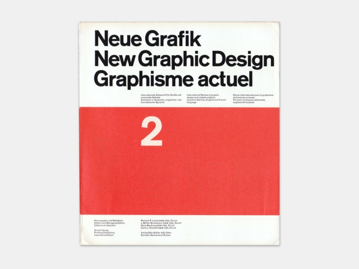
Neue Grafik


.jpg)


Beaut. Really interesting for me as I want to make something print based similar as a culmination and ongoing investigation.
Launched in 1959 by four Swiss designers.
A magazine devoted to Swiss design and typography.
Team of editors:
Jösef Müller-Brockmann
Richard P. Lohse
Hans Neuburg
Carlo Vivarelli
Signed some stuff with joint acronym "LMNV"
Neue Grafik epitomised Swiss typography of the 50s.
A new age manifesto for the design world.
Huge influence on International design post-WWII
Swiss style > International Style.
Article
---------------------------------------------------------------------------------------------------------------------------


No comments:
Post a Comment