Posters are a substantial part of this project, as they're a creative interest and ambition of mine but I don't want to just do posters as that isn't suitable.
Japanese Graphic Design is something I plan on looking into deeply and combining with my own design style to create something relevant and creative for the subject. Here are some I feel inspired by:
These would all work really well in terms of screen-print, the bottom two probably definitely are, I plan to use this brief as an opportunity to explore screen-print further and it's also very relevant, digitally printed posters go against the traditional and spiritual vibe of Martial Arts culture.
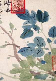
Traditional Japanese prints
I feel really inspired and personally in terms of my creative interest Japanese traditional prints and graphic design from the 50's and 60's onwards still remain relatively similar with emphasis on layering colour and working with colour economically and effectively. The colours come across vibrant and efficient.
Woodblock prints. This is definitely a format and print process to look into, woodblock printing is an area I've not explored and this could be a chance to, especially in terms of luxurious and protective stock.
Layering elements and colour screens.
Process?
Excerpts from: http://en.wikipedia.org/wiki/Japanese_art
Until modern times, the Japanese wrote with a brush rather than a pen, and their familiarity with brush techniques has made them particularly sensitive to the values and aesthetics of painting.
With the rise of popular culture in the Edo period, a style of woodblock prints called ukiyo-e became a major art form and its techniques were fine tuned to produce colorful prints of everything from daily news to schoolbooks.
Art of the Edo period
The Tokugawa shogunate gained undisputed control of the government in 1603 with a commitment to bring peace and economic and political stability to the country; in large measure it was successful. The shogunate survived until 1867, when it was forced to capitulate because of its failure to deal with pressure from Western nations to open the country to foreign trade. One of the dominant themes in the Edo period was the repressive policies of the shogunate and the attempts of artists to escape these strictures. The foremost of these was the closing of the country to foreigners and the accoutrements of their cultures, and the imposition of strict codes of behavior affecting every aspect of life, the clothes one wore, the person one married, and the activities one could or should not pursue.
In the early years of the Edo period, however, the full impact of Tokugawa policies had not yet been felt, and some of Japan's finest expressions in architecture and painting were produced: Katsura Palace in Kyoto and the paintings of Tawaraya Sōtatsu, pioneer of the Rimpa school.
Architecture: Katsura Detached Palace, built in imitation of Genji's palace, contains a cluster of shoin buildings that combine elements of classic Japanese architecture with innovative restatements. The whole complex is surrounded by a beautiful garden with paths for walking. Many of powerful Daimyo (feudal lords) built a Circuit style Japanese garden in the territory country, and competed for the beauty.
Painting: Sōtatsu evolved a superb decorative style by re-creating themes from classical literature, using brilliantly colored figures and motifs from the natural world set against gold-leaf backgrounds. One of his finest works is the pair of screens The Waves at Matsushima in the Freer Gallery in Washington, D.C. A century later, Korin reworked Sōtatsu's style and created visually gorgeous works uniquely his own. Perhaps his finest are the screen paintings of red and white plum blossoms.
Sculpture The Buddhist monk Enkū carved 120,000 Buddhist images in a rough, individual style.
Woodblock prints and Bunjinga: The school of art best known in the West is that of the ukiyo-e paintings and woodblock prints of the demimonde, the world of the kabuki theater and the brothel district. Ukiyo-e prints began to be produced in the late 17th century, but in 1764 Harunobu produced the first polychrome print. Print designers of the next generation, including Torii Kiyonaga and Utamaro, created elegant and sometimes insightful depictions of courtesans.
In the 19th century the dominant figure was Hiroshige, a creator of romantic and somewhat sentimental landscape prints. The odd angles and shapes through which Hiroshige often viewed landscape, and the work of Kiyonaga and Utamaro, with its emphasis on flat planes and strong linear outlines, had a profound impact on such Western artists as Edgar Degas and Vincent van Gogh. Via artworks held in Western museums, these same printmakers would later exert a powerful influence on the imagery and aesthetic approaches used by earlyModernist poets such as Ezra Pound, Richard Aldington and H.D..[10]
Another school of painting contemporary with ukiyo-e was Bunjinga, a style based on paintings executed by Chinese scholar-painters. Just as ukiyo-e artists chose to depict figures from life outside the strictures of the Tokugawa shogunate, Bunjin artists turned to Chinese culture. The exemplars of this style are Ike no Taiga, Yosa Buson, Tanomura Chikuden, and Yamamoto Baiitsu.
Contemporary Relevant Poster design
Studio FNT are a huge inspiration of mine and their experimental take on layering image and type is definitely the kind of work I want to be producing and feel myself slowly starting to become involved with but want to practice more and put into my portfolio. Studio FNT are a Korean based design studio specialising in promotional and editorial design.


No comments:
Post a Comment