

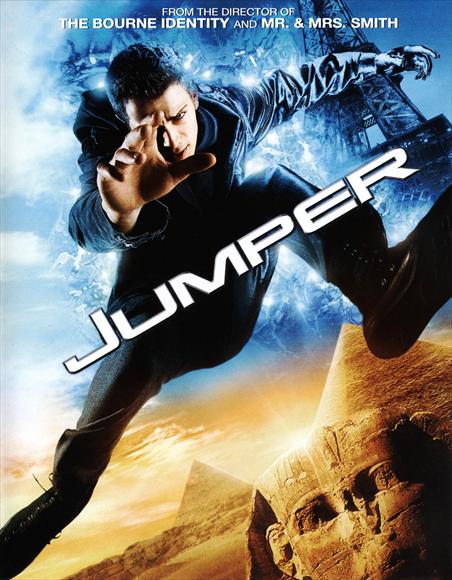
Orange and blue are both complementary colours, as they're both opposite each other on the colour wheel. They're both primary colours and they both contrast and work off each other quite intensely, they both kind of fight for your attention. This sort of stuff was looked in depth in Freds 3rd and 4th Colour Theory lectures which I will be looking through on my blog very soon.
I've noticed orange and blue gets used ALOT for film posters and also in film scenes themselves, possibly because, as I said, they both fight for your attention so you get maximum levels of eye-catching..ness. It's pretty route one stuff for blockbuster posters nowadays. Check this out...
"Ever since the poster for 2002's The Bourne Identity, movie marketers have shown their true colors when touting action-oriented films. And those colors tend to be orange and blue, in a striking combination. ''Orange and blue are complementary colors, so just by nature they give you that jolt that you need,'' says veteran movie adman Charles Reimers, who designed Bourne's one-sheet. ''The studio's always saying 'Make it pop,' and those two are the big favorites because red and green just take you to Christmas.'' - Keith Stasciewicz (2010)


No comments:
Post a Comment