Wednesday, 31 October 2012

The Gaze: Women in Media

Following on fron The Gaze seminar I thought I'd look on the opposite side of the coin and look at women who kind of defied cultural norms and went against the expected perceptions of being just objects of desire who were weak and passive. Sometimes some examples which I'll show in a way kind of embraced this but took it forward.


Ellen Ripley (1979-)
Alien movie series. Assertive figure.


Ripley is first introduced in Alien in 1979. She played a pivotal character in the movie regardless of the plot elements - she plays a warrant officer and first class Lieutenant. A position of power and reputation. An extra-terrestrial alien makes it's way onto the ship and kills all her crew members except fo Ripley. Ripley was probably one of the first times a woman played a central role of the protagonist in an action-orientated role and challenged perceptions. There was a lot more to her than just a pretty face after attention.

Feminist Susan Faludi writes of Ripley in Backlash that, "The tough-talking space engineer who saves an orphan child in Aliens is sympathetically portrayed, but her willfulness, too, is maternal; she is protecting the child - who calls her 'Mommy' - from female monsters."

Entertainment Weekly ranked Ripley 5th on their list of The 20 All Time Coolest Heroes in Pop Culture, calling her "one of the first female movie characters who isn't defined by the men around her, or by her relationship to them"

Watching the film there are some scenes such as when she dresses down to just her underwear, where the camera work really seems to accentuate the notion that she's undressed and looking at the bigger picture, there's not really much need for this scene. It's not essential, it's arguable it could be a reference to the expected perceptions of women in movies compared to what we just witnessed beforehand, which was Ripley battling an alien on her own.

Ripley was one of the first times a woman in a movie was the central heroic figure defying the odds instead of being a damsel in distress. It set a precedent for female figures to come.


Bond girls (1962-present)
Generally passive figures.

Bond girls are a traditional feature of pretty much every Bond movies. I think the role given to Bond girls has changed over time as attitudes towards women has slightly changed. In the past, they were pretty much objects of desire, with no real purpose in the plot and no real aid to James Bond. Bond often just had relations with them and then carried on doing his job. In more recent ones the Bond Girls are perhaps more substantial to the plot but still nowhere near as important enough to be a supporting or secondary protagonist/antagonist.

Even the notion of being a 'bond girl' itself is a topic worthy of discussing itself. Famous movie stars and models aspire to be labelled a 'bond girl'. Not an actress, or a supporting actress but a bond girl. Many times, the actress in question is probably better known as a 'bond girl' than her actual name itself.

Let's compare early Bond Girl names to more recent ones


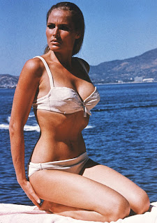
Honey Ryder - Dr No - 1962


Pussy Galore - Goldfinger - 1964


To more recent Bond Girls


Dr. Christmas Jones - The World Is Not Enough - 1999


Severine - Skyfall - 2012


Overall, these characters play a pretty small part of the plot and are often not in it for long and often are there to be objects for James Bond. One or two of these are actually killed off without having much of a say in the plot.


Lara Croft
Tomb Raider series
Assertive figure


Lara Croft came to prominence in the mid 90's as the star and hero of the Tomb Raider adventure and platform gaming series. Being a sort of female Indiana Jones, Lara Croft was pretty much the first time a woman was the central figure in an action video game. Pretty much how Ripley was in movies.

What's interesting about Lara Croft is she's assertive and challenges our gaze, often appearing in adverts and posters staring right at us and actually attempting to be sexually appealing and inviting but at the same time dominant and assertive. It's almost as if the character addressed and embraces previous historical ideas of the gaze and takes them forward as an asset, not a detrement to the character. In turn, Lara Croft has become a video game and pop culture icon of the 90s, spawning a movie franchise along with it and numerous endorsements with brands such as Lucozade.

"There was something refreshing about looking at the screen and seeing myself as a woman. Even if I was performing tasks that were a bit unrealistic…  I still felt like, Hey, this is a representation of me, as myself, as a woman. In a game. How long have we waited for that?" 
(Nikki Douglas in Cassell and Jenkins 1999)


"Lara's phenomenal success wasn't just about a cracking adventure, other games had that too. Lara had something that hooked the gamers like nothing has before. At the center of Tomb Raider was a fantasy female figure. Each of her provocative curves was as much part of the game as the tombs she raided. She had a secret weapon in the world of gaming, well... actually two of them" 
(Lethal & Loaded, 8.7.01)


"It is clear that the producers of Lara wanted to market her as a characterpotentially appealing to women; her arrival on the game scene dovetailed nicely with the 90's "girlpower" zeitgeist and could potentially have hit a positive chord with the emergent "laddette" culture which very much centred around playing "lads" at their own game"
- Helen W. Kennedy
Lara Croft: Feminist Icon or Cyberbimbo?


The Gaze: Seminar


 ads

The way women were portrayed.

Hans Memling "Vanity" 1485


Idea of looking at her without her looking back. Objectifying women. The women's on display for our viewing pleasure.

Objectifying "Students not individuals." "A blonde not a person." Feminism.


Reciprocity, giving and taking. Unbalanced. Fundamentally about power.

Allowed to look without being looked at. Gaze upon without being gazed upon. She's vain. "She's kind of asking for it"

Men would buy the painting. They'd be using their symbolic power. Patriarchal households.

Consumed by men. Society was patriarchal. Nude became accepted. Mens power over women.

Power domination. Patriarchal ideal of femininity.

Male - Active/Dominant

Controlled means of visual design. Very few female artists in history, still very few now compared to men.


Women objectified and sexualised on display. Culture has made this. As women have never been the symbol of the dominant, bread-winner in culture and society.

"The Birth of Venus" by Cabanel 


The Birth of Venus is passive. We're gazing at her, but she's not gazing back and arguably knows she's being gazed upon but doesn't want to look straight back at you and instead is kind of looking away and hiding her face in a shy manner. The male would feel dominant in this situation, or whoever is gazing upon the painting. Fundamentally a fantasy. But made by real people. 

"Sage" in culture. Abstract notion of art. Right in the middle of industrialisation, mid 19th century.

Olympic, Manet. 1863


This, unlike the birth of venus shows an active figure. It's kind of not art, but reality. A comment on the gaze relations in the production of at. Challenges the safe notion that women are passive and you can't actually look at them without being challenged by the woman.

Analysing the art you can study the body language of the woman in question and guess she's probably a prostitute, being delivered flowers from suitors. Her head is risen off the pillow and she's clearly acknowledging our gaze and looking directly at us. Her left hand is kind of placed to cover up, rather than invite.

The black cat can also be symbolic of independence.

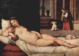
This is in contrast to Titian's Venus of Urbino, 1538


The woman in questions body language here is much more inviting than Manet's. Acknowledging our presence but also kind of inviting. Manet's painting may be a comment on Titian's painting, some 300 years later. Her head and general body posture is very laid back and comfortable, kind of seductive. She looks like she's got all dressed, done her hair for this painting. her left hand isn't really covering up but kind of inviting you.

In this case, similar to Manet's piece there are animals in the picture, but a dog instead of a black cat. A dog can symbolise being a master, almost as if this is a scene you could come home to after a long day at work bread-making. The women is again, given the status of being at home, making herself an object of desire for the male again. Objectified.


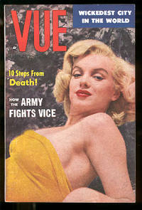
Vue America's Photo Digest

Women being objects of desire and basically the idea of sex sells. But the idea of sex sells only seems to be purveyed through women. Not men, especially in the past, maybe not as much now.


"My Hobby is Men" sexual tittilation. She's asking for it, women just want sex and men will give it to them.

There are hundreds of magazines out there even now such as this where the main topics are about how to please men and how to attract men. Kind of the idea of women running around trying to please men, while men don't worry about it and do manly stuff like make money and feed families.

"Cure for frigidity" - if someone doesn't want to have sex with you then she's just mad, she's crazy. Get her cured.

Women used to be painted and captured with kind of child-like faces. I guess this can be another way to feel superior over women and in a way make them look pure and a bit like a virgin, perhaps. Which is historically an appealing way of objectifying women as objects of desire.


e.g. Katie Price is an object of desire and an overly sexualised pop culture icon. At the same time as being appreciated, she's also at the same time a butt of many jokes and a symbol of the negative side of todays culture of excess. Kind of like the media supports you and feeds you and at the same time mocks you and takes away from you to keep you where they want you to be. Supporting and punishing at the same time.


The Sun Page 3 girls - Einstein Quote gags. Almost implying that it's funny because these naked models couldn't possibly be clever enough to know Einstein quotes.


Her body language is quite dominant, cocky and assertive. The roles are reversed here in terms of the gaze. She's challenging our gaze and challenging the perceptions that may be had regarding cooking. This is aimed at both men and women. Sexually appealing to men and giving girls independence and confidence in terms of appealing to men. Again, the idea of appealing to men. A bra which is an object with a function has been sexualised in order to appeal to men and probably the main reason women buy certain underwear.

Bond girls - objects of desire and sex appeal and have very little value in terms of making a stamp on the plot. Often just discarded and in very few scenes.


Legacy of Image Making - Women's magazines, more concerned with what men want, whereas mens mags just have girls as objects. For example Nuts compared to something like hello, both of which target roughly the same age group but in opposite sexes.

Aimed at guys. 

Aimed at women.


Thursday, 25 October 2012

Thinking With Type

Source: http://www.thinkingwithtype.com/contents/letter/

Some information for myself, to educate me on type, an area I really want to investigate this year and also for Graham's type sessions. The sourced article was very educational and I plan on reading over this regularly till it's engraved in my brain.


Some notes:

OVERHANG - Curved letters often hang a little bit lower than the baseline, as do commas and semi-colons. If they sat on the baseline like other letterforms, rounded letters would look smaller than their flat-footed counterparts

Most typeface aren't divided exactly in half like how kids handwriting books used to teach you to write. The x-height usually occupies a little bit more than half of the cap-height. In a field of text, such a sentense the most density occurs between the baseline and the x-height.

CAP HEIGHT - length from baseline to top of capital letter

ASCENDER HEIGHT - Some elements such as ascenders sometimes progress a little bit beyond the cap height.


HELVETICA 9/8 = Helvetica 9pt with 8pt line spacing.


1 point = 0.35 millimeters

1 point = 1/72 inches.

72 point = 1 inch

1 pica = 12 point

Picas are often used to measure column widths.


A Typeface is measured from the top of the capital-letter (cap-height) to the bottom of the descender (descender height) 


When setting type, in metal type. The pt size is the size of the metal slug NOT the size of the actual letterform itself. - this is why sometimes fonts look very different in size even though they're the same point size.


SET-WIDTH : The body of the letter plus a sliver of space next to it to protect it from the letters around it like a buffer.

So for example when you have condensed typefaces. They have narrower set-widths.


x-heights affect the visual effect of a typeface and can make it seem larger than it is, often more delicate and 'decorative' fonts have a smaller x-height than assertive and bold fonts such as Helvetica.


TYPE CLASSIFICATION: HUMANIST/TRANSITIONAL/MODERN - GEOMETRIC

Serif:

Humanist - emulating classic calligraphy, such as Claude Garamond typefaces of the 15th and 16th century

Transitional - Roots in the 18th century. Usually have slightly sharper serifs and more of a vertical axis. The apex of the A's is often sharp, instead of having a little lip like the Humanist typefaces. e.g. Baskerville

Modern - Roots in the 18th and 19th century. Radically abstract from Humanist and traditional forms. Have straight unbracketed serifs. With thicker strokes than previous classifications and more difference between thick and thin strokes. e.g. Bodoni


Egyptian/Slab Serif - More decorative fonts introduced in the 19th century. More bold and have heavy slab-like serifs. They also have less thick/thin strokes with the strokes pretty much even throughout. e.g. Clarendon/Rockwell


Sans-Serif typefaces became common in the 20th century.

Sans Serif:

Humanist: Still referencing the roots in humanist typefaces such as Garamond. For example Gill Sans designed in 1928 has humanistic characteristics. Calligraphic variations in line weight.

Transitional: Helvetica designed by Max Miedinger in 1957 is an example of a transitional typeface and is similar in some ways to the transitional serif fonts of the 18th century such as Baskerville. High x-height and use of the teardrop a.


HANGING QUOTATION MARKS - These are quotation marks which hand off the copy, and enter into the margin so it doesn't carve out chunks of white space from the edge of your paragraph.

To make a hanging quotation mark, insert a word space before the quotation mark. Pressing the option key, use the left arrow key to back the quotation mark into the margin. You can also use the Optical Margin Alignment or Indent To Here tools.


PUNCTUATION:
Use TAB to indent, not space. HTML doesn't even understand a double space.

EN SPACES - A space a bit more pronounced than a word space. Good for separating a sub-heading from the text that follows.

EM DASHES - A dash which is one EM wide. So it's as wide as the pt size of the typeface you're using.

HATCH MARKS - Prime and Hatch marks are often used for feet and inches. Be careful not to use apostrophes or quotation marks in these instances or single quotation marks.


The first step in designing a typeface is to define a basic concept. Will the letters be serif or sans serif? Will they be modular or organic? Will you construct them geometrically or base them on handwriting? Will you use them for display or for text? Will you work with historic source material or invent the characters more or less from scratch? The next step is to create drawings.


Begin by drawing core letters such as o, u, h and n. Allowing you to build the core visual style and come to terms with the curves and general rules and logic to the typeface.


FONT FORMATS

Purchasing fonts from type foundries such as : Adoba and FontShop.


POSTSCRIPT TYPE 1 - was developed for computers in the 1980s. Type 1 fonts come with two files, a screen font file and a print font file, install both to use properly.

TRUETYPE: Created by Apple and Microsoft for use with their OS. Single file font instead of two like with Type 1.

OPENTYPE: Developed by Adobe, works on multiple formats. Each file supports up to 65,000 characters. in Truetype and Type 1, small caps, ligatures and other special characters must be contained in separate font files but this isn't a problem with Opentype. You can get some "PRO" Opentype fonts which have even more stuff in them.


TYPEFACE OR FONT? 
Typeface is the design of the font. Font is the delivery mechanism. In setting type, the font is the metal is the cast metal printing types. In digital, font is the software which allows you to install and output the font.


/////


Letter

Anatomy

Anatomy: How Letters Sit on a Line

Size

height 
Attempts to standardize the measurement of type began in the eighteenth century. The point system is the standard used today. One point equals 1/72 inch or .35 millimeters. Twelve points equal one pica, the unit commonly used to measure column widths. Typography can also be measured in inches, millimeters, or pixels. Most software applications let the designer choose a preferred unit of measure; picas and points are standard defaults.

Nerd Alert: Abbreviating Picas and Points
8 picas = 8p
8 points = p8, 8 pts
8 picas, 4 points = 8p4
8-point Helvetica with 9 points of line spacing = 8/9 Helvetica
width
A letter also has a horizontal measure, called its set width. The set width is the body of the letter plus a sliver of space that protects it from other letters. The width of a letter is intrinsic to the proportions and visual impression of the typeface. Some typefaces have a narrow set width, and some have a wide one. You can change the set width of a typeface by fiddling with its horizontal or vertical scale.This distorts the line weight of the letters,however, forcing heavy elements to become thin, and thin elements to become thick. Instead of torturing a letterform, choose a typeface that has the proportions you are looking for, such as condensed, compressed, wide, or extended.

Size Crime: Vertical or Horizontal Scaling

Size: The Power of X-Heights

Size: Variations on a Typeface

All the typefaces shown below were inspired by the sixteenth-century printing types of Claude Garamond, yet each one reflects its own era. The lean forms of Garamond 3 appeared during the Great Depression, while the inflated x-height of ITC Garamond became an icon of the flamboyant 1970s.
download hi-res pdf: Portrait of Four Garamonds

Optical Sizes

A type family with optical sizes has different styles for different sizes of output.The graphic designer selects a style based on context. Optical sizes designed for headlines or display tend to have delicate, lyrical forms, while styles created for text and captions are built with heavier strokes.

Optical Sizes: Adobe Garamond Premiere Pro

download hi-res pdf: Optical Sizes

Scale

Scale is the size of design elements in comparison to other elements in a layout as well as to the physical context of the work. Scale is relative. 12-pt type displayed on a 32-inch monitor can look very small, while 12-pt type printed on a book page can look flabby and overweight. Designers create hierarchy and contrast by playing with the scale of letterforms. Changes in scale help create visual contrast, movement, and depth as well as express hierarchies of importance. Scale is physical. People intuitively judge the size of objects in relation to their own bodies and environments.
the xix amendment Typographic installation at Grand Central Station, New York City, 1995. Designer: Stephen Doyle. Sponsors: The New York State Division of Women, the Metropolitan Transportation Authority, Revlon, and Merrill Lynch. Large-scale text creates impact in this public installation.

Type Classification

A basic system for classifying typefaces was devised in the nineteenth century, when printers sought to identify a heritage for their own craft analogous to that of art history. Humanist letterforms are closely connected to calligraphy and the movement of the hand. Transitional and modern typefaces are more abstract and less organic. These three main groups correspond roughly to the Renaissance, Baroque, and Enlightenment periods in art and literature. Historians and critics of typography have since proposed more finely grained schemes that attempt to better capture the diversity of letterforms. Designers in the twentieth and twenty-first centuries have continued to create new typefaces based on historic characteristics.
download hi-res pdf: 
Type History Lecture

download hi-res pdf: 
Type History Lecture in Spanish
, contributed by Laura Meseguer

Type Families

In the sixteeenth century, printers began organizing roman and italic typefaces into matched families. The concept was formalized in the early twentieth century to include styles such as bold, semibold, and small caps.
download hi-res pdf: Type Families

Type Family in Use: Garamond 3

mcsweeney's Magazine cover, 2002. Design: Dave Eggers. This magazine cover uses the Garamond 3 typeface family in various sizes. Although the typeface is classical and conservative, the obsessive, slightly deranged layout is distinctly contemporary.

Superfamilies

A traditional roman book face typically has a small family–an intimate group consisting of roman, italic, small caps, and possibly bold and semibold (each with an italic variant) styles. Sans-serif families often come in many more weights and sizes, such as thin, light, black, compressed, and condensed. Asuperfamily consists of dozens of related fonts in multiple weights and/or widths, often with both sans-serif and serif versions. Small capitals and non-lining numerals (once found only in serif fonts) are included in the sans-serif versions of Thesis, Scala Pro, and many other contemporary superfamilies.
univers was designed by the Swiss typographer Adrian Frutiger in 1957. He designed twenty-one versions of Univers, in five weights and five widths. Whereas some type families grow over time, Univers was conceived as a total system from its inception.
TRILOGY, a superfamily designed by Jeremy Tankard in 2009, is inspired by three nineteenth-century type styles: sans serif, Egyptian, and fat face. The inclusion of the fat face style, with its wafer-thin serifs and ultrawide verticals, gives this family an unusual twist.

Portrait of a Superfamily: Thesis

Caps and Small Caps

A word set in ALL CAPS within running text can look big and bulky, and A LONG PASSAGE SET ENTIRELY IN CAPITALS CAN LOOK UTTERLY INSANE. Small capitals are designed to match the x-height of lowercase letters. Designers, enamored with the squarish proportions of true small caps, employ them not only within bodies of text but for subheads, bylines, invitations, and more. Rather than Mixing Small Caps with Capitals, many designers prefer to use all small caps, creating a clean line with no ascending elements. InDesign and other programs allow users to create FALSE SMALL CAPS at the press of a button; theseSCRAWNY LETTERS look out of place.
download hi-res pdf: Caps and Small Caps in Context

Capitals in Use

amusement magazine Design: Alice Litscher, 2009. This French culture magazine employs a startling mix of tightly leaded Didot capitals in roman and italic. Running text is set in Glypha.

Mixing Typefaces

Combining typefaces is like making a salad. Start with a small number of elements representing different colors, tastes, and textures. Strive for contrast rather than harmony, looking for emphatic differences rather than mushy transitions. Give each ingredient a role to play: sweet tomatoes, crunchy cucumbers, and the pungent shock of an occasional anchovy. When mixing typefaces on the same line, designers usually adjust the point size so that the x-heights align. When placing typefaces on separate lines, it often makes sense to create contrast in scale as well as style or weight. Try mixing big, light type with small, dark type for a criss-cross of contrasting flavors and textures.

Mixing Typefaces: Single-Family and Multi-Family

Mixing Typefaces: The Small Print

the word: new york magazine Design: Chris Dixon, 2010. This content-intensive page detail mixes four different type families from various points in history, ranging from the early advertising face Egyptian Bold Condensed to the functional contemporary sans Verlag. These diverse ingredients are mixed here at different scales to create typographic tension and contrast.

Numerals

Lining numerals take up uniform widths of space, enabling the numbers to line up when tabulated in columns. They were introduced around the turn of the twentieth century to meet the needs of modern business. Lining numerals are the same height as capital letters, so they sometimes look big and bulky when appearing in running text.
Non-lining numerals, also called text or old style numerals, have ascenders and descenders, like lowercase letters. Non-lining numerals returned to favor in the 1990s, valued for their idiosyncratic appearance and their traditional typographic attitude. Like letterforms, old style numerals are proportional; each one has its own set width.

Numerals: Examples

monthly calendar, 1892 The charming numerals in this calendar don't line up into neat columns, because they have varied set widths. They would not be suitable for setting modern financial data.

Punctuation

A well-designed comma carries the essence of the typeface down to its delicious details. Helvetica's comma is a chunky square mounted to a jaunty curve, while Bodoni's is a voluptuous, thin-stemmed orb. Designers and editors need to learn various typographic conventions in addition to mastering the grammatical rules of punctuation. A pandemic error is the use of straight prime or hatch marks (often called dumb quotes) in place of apostrophes and quotation marks (also known as curly quotes, typographer's quotes, or smart quotes). Double and single quotation marks are represented with four distinct characters, each accessed with a different keystroke combination. Know thy keystrokes! It usually falls to the designer to purge the client's manuscript of spurious punctuation.

Punctuation Crimes

type crimes: new york city tour City streets have become a dangerous place. Millions of dollars a year are spent producing commercial signs that are fraught with typographic misdoings. While some of these signs are cheaply made over-the-counter products, others were designed for prominent businesses and institutions. There is no excuse for such gross negligence.
gettin’ it right Apostrophes and quotation marks are sometimes called curly quotes. Here, you can enjoy them in a meat-free environment.
gettin it wrong The correct use of hatch marks is to indicate inches and feet. Alas, this pizza is the hapless victim of a misplaced keystroke. In InDesign or Illustrator, use the Glyphs palette to find hatch marks when you need them.

Punctuation for Typographers

Writers or clients often supply manuscripts that employ incorrect dashes or faulty word spacing. Consult a definitive work such as The Chicago Manual of Stylefor a complete guide to punctuation. The following rules are especially pertinent for designers.
word spaces are created by the space bar. Use just one space between sentences or after a comma, colon, or semicolon. One of the first steps in typesetting a manuscript is to purge it of all double spaces. Thus the space bar should not be used to create indents or otherwise position text on a line. Use tabs instead. html refuses to recognize double spaces altogether.
en spaces are wider than word spaces. An en space can be used to render a more emphatic distance between elements on a line: for example, to separate a subhead from the text that immediately follows, or to separate elements gathered along a single line in a letterhead.
em dashes express strong grammatical breaks. An em dash is one em wide-the width of the point size of the typeface. In manuscripts, dashes are often represented with a double hyphen (--); these must be replaced.
en dashes serve primarily to connect numbers (1-10). An en is half the width of an em. Manuscripts rarely employ en dashes, so the designer needs to supply them.
hyphens connect linked words and phrases, and they break words at the ends of lines. Typesetting programs break words automatically. Disable auto hyphenation when working with ragged or centered text; use discretionary hyphens instead, and only when unavoidable.
discretionary hyphens, which are inserted manually to break lines, only appear in the document if they are needed. (If a text is reflowed in subsequent editing, a discretionary hyphen will disappear.) Wayward hyphens often occur in the mid-dle of a line when the typesetter has inserted a "hard" hyphen instead of a discretionary one.
quotation marks have distinct "open" and "closed" forms, unlike hatch marks, which are straight up and down. A single close quote also serves as an apostrophe ("It's Bob's font."). Prime or hatch marks should only be used to indicate inches and feet (5'2''). Used incorrectly, hatches are known as "dumb quotes." Although computer operating systems and typesetting programs often include automatic "smart quote" features, e-mailed, word-processed, and/or client-supplied text can be riddled with dumb quotes. Auto smart quote programs often render apostrophes upside down (‘tis instead of 'tis), so designers must be vigilant and learn the necessary keystrokes.
ellipses consist of three periods, which can be rendered with no spaces between them, or with open tracking (letterspacing), or with word spaces. An ellipsis indicates an omitted section in a quoted text or...a temporal break. Most typefaces include an ellipsis character, which presents closely spaced points.

Typeface Design

Fontlab and other applications allow designers to create functional fonts that work seamlessly with standard software programs such as InDesign and Photoshop. The first step in designing a typeface is to define a basic concept. Will the letters be serif or sans serif? Will they be modular or organic? Will you construct them geometrically or base them on handwriting? Will you use them for display or for text? Will you work with historic source material or invent the characters more or less from scratch? The next step is to create drawings. Some designers start with pencil before working digitally, while others build their letterforms directly with fontdesign software.
Begin by drawing a few core letters, such as o, u, h, and n, building curves, lines, and shapes that will reappear throughout the font. All the letters in a typeface are distinct from each other, yet they share many attributes, such as x-height, line weight, stress, and a common vocabulary of forms and proportions. You can control the spacing of the typeface by adding blank areas next to each character as well as creating kerning pairs that determine the distance between particular characters. Producing a complete typeface is an enormous task. However, for people with a knack for drawing letterforms, the process is hugely rewarding.

Typeface Drawing: Castaways

castaways Drawing and finished type, 2001. Art and type direction: Andy Cruz. Typeface design: Ken Barber/House Industries. Font engineering: Rich Roat. House Industries is a digital type foundry that creates original typefaces inspired by popular culture and design history. Designer Ken Barber makes pencil drawings by hand and then digitizes the outlines. Castaways is from a series of typefaces based on commercial signs from Las Vegas. The shapes of the letters recall the handpainted strokes made by traditional sign painters and lettering artists.

Typeface Proof: Mercury

mercury bold Page proof and screen shot, 2003. Design: Jonathan Hoefler/Hoefler & Frere-Jones. Mercury is a typeface designed for modern newspapers, whose production demands fast, high-volume printing on cheap paper. The typeface's bullet-proof letterforms feature chunky serifs and sturdy upright strokes. The notes marked on the proof below comment on everything from the width or weight of a letter to the size and shape of a serif. Many such proofs are made during the design process. In a digital typeface, each letterform consists of a series of curves and lines controlled by points. In a large type family, different weights and widths can be made automatically by interpolating between extremes such as light and heavy or narrow and wide. The designer then adjusts each variant to ensure legibility and visual consistency.

Project: Letterforms

Create a prototype for a bitmap typeface by designing letters on a grid of squares or a grid of dots. Substitute the curves and diagonals of traditional letterforms with gridded and rectilinear elements. Avoid making detailed “staircases,” which are just curves and diagonals in disguise. This exercise looks back to the 1910s and 1920s, when avant-garde designers made experimental typefaces out of simple geometric parts. The project also speaks to the structure of digital technologies, from cash register receipts and LED signs to on-screen font display, showing that a typeface is a system of elements.
Examples of student work from Maryland Institute College of Art

Font Formats

Where do fonts come from, and why are there so many different formats? Some come loaded with your computer's operating system, while others are bundled with software packages. A few of these widely distributed typefaces are of the highest quality, such as Adobe Garamond Pro and Hoefler Text, while others (including Comic Sans, Apple Chancery, and Papyrus) are reviled by design snobs everywhere. If you want to expand your vocabulary beyond this familiar fare, you will need to purchase fonts from digital type foundries. These range from large establishments like Adobe and FontShop, which license thousands of different typefaces, to independent producers that distribute just a few, such as Underware in the Netherlands or Jeremy Tankard Typography in the U.K. You can also learn to make your own fonts as well as find fonts that are distributed for free online. The different font formats reflect technical innovations and business arrangements developed over time. Older font formats are still generally usable on modern operating systems.
PostScript/Type 1 was developed for desktop computer systems in the 1980s by Adobe. Type I fonts are output using the PostScript programming language, created for generating high-resolution images on paper or film. A Type 1 font consists of two files: a screen font and a printer font. You must install both files in order to fully use these fonts.
TrueType is a later font format, created by Apple and Microsoft for use with their operating systems. TrueType fonts are easier to install than Type 1 fonts because they consist of a single font file rather than two.
Opentype, a format developed by Adobe, works on multiple platforms. Each file supports up to 65,000 characters, allowing multiple styles and character variations to be contained in a single font file. In a TrueType or Type 1 font, small capitals, alternate ligatures, and other special characters must be contained in separate font files (sometimes labelled "Expert"); in an OpenType font they are part of the main font. These expanded character sets can also include accented letters and other special glyphs needed for typesetting a variety of languages. OpenType fonts with expanded character sets are commonly labeled “Pro.” OpenType fonts also automatically adjust the position of hyphens, brackets, and parentheses for letters set in all-capitals.

Some Commonly Abused Terms

typeface or font?
A typeface is the design of the letterforms; a font is the delivery mechanism. In metal type, the design is embodied in the punches from which molds are made. A font consists of the cast metal printing types. In digital systems, the typeface is the visual design, while the font is the software that allows you to install, access, and output the design. A single typeface might be available in several font formats. In part because the design of digital typefaces and the production of fonts are so fluidly linked today, most people use the terms interchangeably. Type nerds insist, however, on using them precisely.
character or glyph?
Type designers distinguish characters from glyphs in order to comply with Unicode, an international system for identifying all of the world's recognized writing systems. Only a symbol with a unique function is considered a character and is thus assigned a code point in Unicode. A single character, such as a lowercase a, can be embodied by several different glyphs (a, a, a). Each glyph is a specific expression of a given character.
Roman or roman?
The Roman Empire is a proper noun and thus is capitalized, but we identify roman letterforms, like italic ones, in lowercase. The name of the Latin alphabet is capitalized.